Sunday 31 December 2017

Quibans 76: Away matches

During the Christmas period (the weekend before Christmas, up until just into the New Year) the Premier League football teams play four games.  BBC Sport website had this as a headline:

Premier League festive fixtures: Which clubs have toughest schedule?

As part of this they looked at how far supporters of each club would travel if they attended all four games.  (Distances are measured by road from the stadium of their own club.) 

Q1) Across the whole season, which team's supporters would you expect to travel the furthest?  Which would travel the least?

Here are the teams and a rough indication of where they are
Arsenal   (London)
Bournemouth   (South coast)
Brighton and Hove Albion   (South coast)
Burnley   (North west)
Chelsea   (London)
Crystal Palace   (London)
Everton   (North west)
Huddersfield Town   (North west)
Leicester City   (Midlands)
Liverpool   (North west)
Manchester City   (North west)
Manchester United   (North west)
Newcastle United   (North east)
Southampton   (South coast)
Stoke City   (Midlands)
Swansea City   (South Wales)
Tottenham Hotspur   (London)
Watford   (London)
West Bromwich Albion   (Midlands)
West Ham United   (London)

Here is a map of the teams (taken from awaydayplanner.com, with the teams highlighted in blue). 

Q2)  Do you want to change your answers?  (NB: Liverpool and Everton are so close together that they appear as a single dot here.)

In the article this graph was included:

Q3)  What sort of correlation do you think there is between the distance travelled during the Christmas period and that travelled during the whole season?  Can you predict the pmcc?

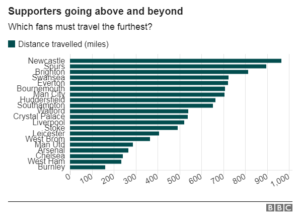
Here are the figures (taken from a Talksport article, from awadayplanner and from the BBC).  The spreadsheet can be downloaded here.


Answers/thoughts

It might initially appear that all teams will travel the same distance to play each other, but further reflection suggests that teams that are closer to the middle of the country are likely to travel the least.
There are several ways to think about this.  There are six teams in London.  Their journeys to play each other will be quite short, but for Newcastle to play each of the six London teams they will need to make six long journeys.

One way to convince yourself that clubs on the periphery are likely to travel furthest (Eg Newcastle, Swansea, Burnley, Brighton) is to go to ridiculous extremes.  If Pluto United joined the premier league then for one game each season the other 19 clubs would travel once to Pluto.  But the fans of Pluto United would have to travel to Earth 19 times to play each of their away games.

In all of this we are making the assumption that each match is a self-contained trip.  It might be possible for Newcastle fans to make a single trip to London and to stay there for all of the London matches, but in practice this will mean living in London for the season, because football teams rarely play two matches in three days and usually (roughly) alternate between playing a match at home and then one away.

The table for Q3 shows the clubs in order.  I had predicted that Newcastle and Swansea would be the two clubs with the furthest journeys and that a north London club would have the shortest journey in total.

Burnley were particularly fortunate with their festive travel distances.  Tottenham Hotspur were a bit hard done by. 
The pmcc is 0.52 - indicating a weak positive correlation.


Sources:
http://www.bbc.co.uk/sport/football/41812290
http://awaydayplanner.com/
https://talksport.com/football/how-far-fans-every-premier-league-club-must-travel-next-season-least-most-distance

Wednesday 20 December 2017

Quibans 75: Don't Panic!

This story appeared in most newspapers.  The Sun put it like this:


200 litres every hour!  Clearly letting in water isn't ideal for a ship, but is 200 litres a lot?

How long before it will sink?

Some data here (from the Daily Telegraph) might help:


Some thoughts/answers:
I googled the capacity of a standard bath-tub.  It appears that 120 litres or 150 litres are fairly common capacities.
To put this into perspective: it's letting in about one and a third bath-tubs of water per hour.  That doesn't seem very much!

A length of 920 feet, beam of 230 feet and draught of 36 feet are given in the Daily Telegraph graphic.  I assume that 'beam' means the width of the ship and that the 'draught' is the amount of ship under the waterline.  There is a lot of aircraft carrier above the waterline, but if we find the rough volume of ship underwater (treating it a cuboid) then we would get 920*0.3 * 230*0.3 * 36*0.3, which is about 200,000 cubic metres.  That's 200 million litres.

At 200 litres per hour that is a nice round million hours before the part currently below the waterline to fill with water.  It will take just over 100 years for this to happen.  So if left untreated, if it still exists in a hundred years, if no-one uses a pump, and if the navy runs out of buckets for bailing purposes, then the ship will probably be in trouble early in the 22nd century.


Sources:
https://www.thesun.co.uk/news/5168494/hms-elizabeth-leak-navy-repairs-millions/
http://www.telegraph.co.uk/news/2017/12/18/hms-queen-elizabeth-britains-new-31bn-aircraft-carrier-has-leak/


Thursday 7 December 2017

Quibans 74: Parking fines

The article below is excerpted from the Cambridge News website (link at the foot of the page).
Read the article, carry out some calculations and comment on the substance of the article.  Some of my ideas follow the article (after a jump).

Where you are most likely to get a parking ticket in Cambridge

One Cambridge road has seen more drivers slapped with parking tickets than any other, new data has revealed.  If you park regularly on Chesterton Road, to the north of the city centre, you may well have seen parking wardens issuing yellow tickets as it is the number one place to get a ticket in Cambridge.
The fining hotspot was revealed after a Freedom of Information Request by insurance comparison website comparethemarket.com, which has detailed an interactive map with its findings.
The data also shows Cambridge was the top city in the East of England for parking fines, with twice as many handed out in the city over three months compared to the next ranking area.
Cambridgeshire County Council issued a total of 12,234 penalty charge notices between July and September 2017, making £281,025 of revenue.
But the region's second parking fine hotspot - East Hertfordshire - lagged behind with 6,950 fines on motorist's vehicles generating a revenue of £191,878.
Simon McCulloch, director at comparethemarket.com said: "Our parking fines hotspots have revealed that motorists need to be extra vigilant when it comes to something as simple as parking their vehicle correctly if they want to avoid a hefty fine.  If you do find yourself with a PCN, it’s worth checking your ticket, as you can often reduce the fee by half, simply by paying it within 7 or 14 days, depending on your local council."

The top 10 parking fine areas in East of England

1. Cambridge (12,234) - £281,025
2. East Hertfordshire (6,950) - £191,878
3. Watford (6,428) - £136,818.69
4. Norwich (5,719) - £171,570
5. St Albans (4,963) - £132,570
6. Colchester (4,791) - £91,220
7. Ipswich (4,551) - £107,044
8. Welwyn Hatfield (3,599) - £79,650
9. Dacorum (2,800) - £90,459
10. Basildon (2,365) - £74,746

Write down comments about the article above before scrolling down to see what I have written.

.

.

.

.

.

.

.

.

.

.

.

.

.

Here are a few ideas.  These are not necessarily complete - there are likely to be other things that can be worked out too.

First of all, it doesn't seem sensible to draw a pie chart (the whole pie would refer to the number of fines or the amount of money from only the top 10 places).  A bar chart might show this well.  A scatter graph would show the relationship between the number of fines (given in brackets) and the amount of money collected.

It is clear that the ranking has been carried out on the number of fines rather than the amount of money, because the former goes down in order whereas the latter jumps around a bit.

We could work out the correlation coefficient and finding that this is 0.95 we could comment that there is a very strong positive correlation between the number of fines and the amount of money paid in fines.  This is perhaps unsurprising.

The 69 pence involved in the Watford total looks a little strange!

The spreadsheet below shows the amount of money per fine.  Presumably the 'money per fine' is not a round number in most cases because fines are different in car parks and on the side of the road and because you get a discount if you pay quickly.  


This makes the Norwich figure of exactly £30 per fine look a little odd.

I followed the link in the article and found the original data.  Here is the section for the East of England:


First of all, this is in alphabetical order of location!  Surely actually ranking them would be more sensible?
Then we have the 'location' which, as per the article, is presumably the location with the most fines.
Finally - have a look at the Norwich revenue!  This wasn't disclosed for some reason.  

The author of the Cambridge News article appears to have decided to assume all of the Norwich fines were £30.  I find it a bit galling that they didn't disclose that in the article.
Maybe a better way to do this would be to use the average of the fines in other places, or to look at the highest and lowest and to give an upper/lower bound?

Final problem with this article and this research is that not all the places listed are the same size!  It would make sense to factor in the population or the number of cars or the number of visitors rather than using the raw figures.

Oh - and last thought: the first sentence is surely trivially true?  Unless there is a tie then it will always be the case that "One Cambridge road has seen more drivers slapped with parking tickets than any other" !


Saturday 18 November 2017

Quibans 73: Food waste

Here are excerpts from four Guardian articles, all from 2017. The original headlines are shown in bold.

Nearly half of all fresh potatoes thrown away daily by UK households

Nearly half of the edible fresh potatoes bought by UK householders each day are thrown away - 5.8 million of them per day, and at a “staggering” annual cost of £230m, figures show.

The humble spud is the second most wasted food in the UK, behind bread, according to campaign material released on Wednesday. The research was offered in support of a government campaign to encourage consumers to reduce their domestic food waste.

The UK churns out 10m tonnes of food waste a year – of which 7.3m tonnes come from households. The estimated retail value of this is £13bn, and Wrap calculates that a typical family wastes £700 of food a year.

Britons to throw away £428m worth of barbecue food in August, study reveals

It’s symbolised by dismal burgers and carbonised sausages served on paper plates with a splatter of ketchup. Yet with the great British summer well under way, Britons are this month set to throw away a staggering £428m worth of barbecue food, research reveals.

In August the nation will brave the changeable weather to enjoy nearly 12m barbecues, with people on average either hosting or attending at least two of the seasonal gatherings. The new research from supermarket chain Sainsbury’s shows that hosts typically over-cater to impress friends and family, with more than half (49.2%) putting on a larger than necessary spread.

Salad leaves, burger rolls, hot dog buns, coleslaw and potato salad are the top five food items most likely to be wasted during barbecue season, the research found, amounting to £36.47 worth of food waste at each event. The total does not include drink.

Salad days soon over: consumers throw away 40% of bagged leaves

Britons throw away 40% of the bagged salad they buy every year, according to the latest data, with 37,000 tonnes – the equivalent of 178m bags – going uneaten every year.

UK throwing away £13bn of food each year, latest figures show

An estimated 7.3m tonnes of household food waste was thrown away in 2015 – up from 7m tonnes in 2012.

UK households binned £13bn worth of food in 2015 that could have been eaten, according to new figures which suggest that progress in reducing the national food waste mountain has stalled.

Of the food thrown away, 4.4m tonnes was deemed to be “avoidable” waste that was edible at some point before it was put in the bin or food waste caddy – such as bread that goes mouldy – compared with 4.2m tonnes in 2012. The rest were scraps that could not be eaten such as meat bones, eggshells, tea bags, coffee grounds, apple cores and fruit and vegetable peelings.

That meant the average UK household wasted £470 worth of food, which went in the bin when it could have been eaten. The avoidable food waste generated 19m tonnes of greenhouse gases over its lifetime – and preventing that pollution would be equivalent to taking one in four cars off UK roads, Wrap said.


Here are some possible questions:
  1. How much does one potato cost?
  2. How much does a kg of food cost?
  3. According to the figures in the first article, how many families are there in the UK?
  4. What errors/inconsistencies are there in the articles?
  5. How do the figures in the BBQ article fit together? 
  6. How much does one bag of salad weigh?
  7. How many bags of salad are bought each year?


Sources:
https://www.theguardian.com/environment/2017/nov/08/nearly-half-of-all-fresh-potatoes-thrown-away-daily-by-uk-households
https://www.theguardian.com/environment/2017/aug/16/britons-to-throw-away-428m-worth-of-barbecue-food-in-august-study-reveals
https://www.theguardian.com/environment/2017/may/24/salad-days-soon-over-consumers-throw-away-40-bagged-leaves
https://www.theguardian.com/environment/2017/jan/10/uk-throwing-away-13bn-of-food-each-year-latest-figures-show

Sunday 5 November 2017

Quibans 72: Academy football

From BBC Sport.  There is some Fermi estimation here alongside the usual skills.

Academy football: Zac Brunt case
There are an estimated 3,000 children aged between nine and 16 in Premier League academies, with thousands more throughout the Football League.

"Unless you're the next [Cristiano] Ronaldo, clubs don't want to pay £120,000 for a 15-year-old."  Aged 15, Zac Brunt has been part of academies at Aston Villa, Manchester City, Atletico Madrid, and most recently Derby.  He spent the past two years with the Championship club's elite academy on what is commonly known as an Elite Player Performance Plan (EPPP) - designed to bring the best young players, the best coaches and the best environments together at an early age.

"I felt like I wasn't getting anywhere at Derby," Brunt told the BBC. "Other clubs are interested but the fee is so big. For two years work, have I cost Derby County £120,000? Probably not.  "I think this could be the end of my career. I can't go anywhere else apart from semi-professional - the highest level I can go - unless a professional team buys me out of this clause."

The Premier League and the English Football League (EFL) said the "vast majority" of young players moving between academies have compensation waived.

Why so much money?
Compensation formula for academy players when joining another club
Age group of player
Category of club academy leaving
Applicable annual fixed fee - new club to pay
U9 to U11
All Categories
£3,000
U12 to U16
Category 1
£40,000
U12 to U16
Category 2
£25,000
U12 to U16
Category 3
£12,500

The £120,000 compensation fee that any other academy must pay Derby to sign Brunt is worked out from his three-year registration at their category one academy (£40,000 + £40,000 + £40,000).

Brunt says he understands the need for a rule to protect clubs' investments, but added: "I know a few boys who have been absolutely ruined by this rule and they had to stop playing football and go and play non-league or something like that because they just can't get in anywhere.

Brunt's dad Glen says his son has been for trials with other top clubs, but the compensation fee is putting them off - comparing it to the £7,000 Derby paid Manchester City to sign the youngster themselves.

So is this an unusual case?
The Premier League and the EFL say so.  For example, from about 3,000 Premier League academy players last season, 210 left a club early and, of those, 182 (##%) had compensation rights waived. That percentage has remained above 80% for the past three years.


Questions:
  1. What inconsistencies are there in the article?
  2. How many children are there in each age group in each club in the premier league?
  3. If Derby get £120,000 what will their percentage profit be?
  4. What percentage of players leave a club early?
  5. How many players from each age group leave each team early each year on average?
  6. How many of these players will play premier league football?


Answers:
  1. He has been at Derby for two years, but will apparently cost other clubs the equivalent of three years of payments (3 x £40,000).    Why did Derby pay £7000 for the player?  Where does that fit into the structure?
  2. Slightly strangely, “Under 9s” means players who are under 9 years old at the start of the season.  By the end of the season it might be the case that all the players are actually 9 years old.  The phrase at the start of the article: “there are 3000 players aged between 9 and 16” might refer to 7 year groups or to 8.  There are 20 clubs in the premier league.  This gives about 20 players in each year group at each club (3000 / (20 x 7.5) ).
  3. 120,000 / 7000 = 17.14   Subtract 1 to leave the profit and then express as a percentage: 1614%
  4. 210 / 3000 = 7%.  [Also: the hashed out figure is 87%.]
  5. 210 leave 20 clubs, which is 10.5 from each club.  Presumably we shouldn’t include the oldest year group (“leave the clubs early”), so divide this by 6 or 7.  It’s just under 2 per year group at each club.
  6. This is interesting (and hard!).  If a club has a senior playing staff of about 30, aged between 18 and 33 then about two of them will retire each year.  Some of the other players will move abroad or to lower-league teams, but some will be replaced with players from abroad or from lower leagues.  Maybe 2 per year from the youth team making it through to each premier league squad is reasonable.  So that’s about 10% of those who are in the top year group.


Friday 20 October 2017

Quibans 71: I’d walk a million miles for one of your goals

Apparently (thanks to Scott for the heads-up), Scottish football fans sing “I’d walk a million miles for one of your goals”.  [Link]  

What questions could we ask and answer?  (My suggestions are below.)
.
.
.
.
.
.
.
.
.
.
.
.
.
.
Questions:
How many times around Scotland would that be?
How many trips from Land’s End to John O’Groats?
How long would it take you?  (What is a reasonable number of miles to walk in a day?)


Answers:
According to Wikipedia, the mainland coastline of Scotland is 6160 miles and the border with England is 96 miles.  This gives 6256 miles in total and 160 laps will be necessary to get over 1 million miles.
Land’s End to John O’Goats is 874 miles – so that’s 1145 journeys to get over a million miles.  (One journey being counted as one direction only.)

If you walk 30 miles a day then it will take over 91 years to do it.  What age would you need to be to start walking this sort of distance, though?

Monday 18 September 2017

Quibans 70: Commuting by train

As part of an article about commuting an article from the Daily Telegraph includes an information box.

It gives numbers and what they stand for.  Match them up.

700 million

100 million

2.99 million

139,000

4.6pc

Journeys made by season ticket holders out of Waterloo station alone

Average amount of weekday morning trains at peak times that were overcrowded

Number of people commuting more than two hours per day in 2014, an increase of 72pc in 10 years

The number of journeys made by season ticket holders across the UK in 2014-15.

Number of people forced to stand every morning on peak trains into the capital - an increase of 19,000 in a year


Here is the box in full:


Questions:

1) What percentage of journeys that were made in 2014-15 involve Waterloo station?

2) How many season ticket holders are there?

3) How many people commuted for more than two hours per day ten years previously?

4) What percentage of season ticket holders travelled longer than 2 hours?

5) By what percentage did the number of people forced to stand on trains into London rise by?

6) If that percentage increase continues, how long will it be before half a million people are standing?  Is this realistic?


Answers:

1) 100/700 = 14.2857...%  Given that the two numbers are clearly not exact it would be appropriate to give the percentage as 14%.

2) This is difficult!  700 million journeys per day.  If a passenger takes more than one train does that count as more than one journey?  How many days per year will they travel?  48 working weeks x 5 days = 240 work-days per year, which will be at least 480 journeys (there and back) per person.  Some will take more than one train so let's call that 500 journeys per person on average.  700 million / 500 = 1.4 million commuters.

3) 2.99 million is 172% of the 10-years-ago value.  Back then it was 2.99 million / 1.72 = 1.74 million

4) 139000 out of 1.4 million = 9.9%.  Call it 10%

5)  In the previous year 120,000 people stood on their train and it rose by 19,000.  This is a 15.8% rise (16%)

6) We need 120 * 1.16^n > 500.  Then we need to subtract 1 from n.  Use a spreadsheet to see that n=10 is the first time 500 is breached.  So a further 9 years will be required.  This involves major extrapolation, so is unlikely to be accurate.


Sunday 17 September 2017

Quibans 69: QR code of trees

From BBC News:

Chinese maze: Village makes giant tech code from trees

At first glance, it could be the courtly maze of an English country manor - albeit with some rather large gaps.


But a tech-savvy eye will instantly see the green design for what it is - a massive QR code.  These high-tech barcodes are hugely popular in China as a way to make cashless payments on a smartphone.

Xilinshui village, in the northern Hebei province, has created one from trees in a bid to raise its profile.  The design was made from 130,000 Chinese junipers, and can be scanned from above using a phone or tablet.

It is not clear how high above the trees you would have to be to scan it - or how you might get there - but visitors who successfully capture the code will be connected to the village's tourism account on WeChat, a Chinese social media site.

The vast design measures 227m (744ft) along each side, and the trees are between 80cm and 2.5m in height, the South China Morning Post reports.  Xilinshui was named "the most beautiful village in Hebei" in 2015, and received a 1.1 million yuan ($168,000; £124,00) development grant from the province.


Some possible questions:

1) What typo is there in the article?
2) You can see this as being made up of square pixels.  What is the side-length of each pixel?
3) How many juniper trees are there in each pixel?
4) What is the conversion factor between metres and feet?
5) Convert the heights of the trees to feet and inches.
6) What are the conversion factors between the currencies?
7) If they spent all of the development grant money on tress how much was each one?
8) How long might it have taken to plant all of the trees?


Some answers:

1) Typo: “($168,000; £124,00) development grant” – it looks as if a zero is missing from the sterling figure.
2) Side-length of each pixel: I count 37 pixels along each edge, but if the empty border is included then it is 39 by 39.  227 metres divided by 37 is 6.1m, whereas 227m divided by 39 is 5.8m.  Let’s say 6m.
3) Number of trees in a pixel: I counted part of it and then scaled up – I got about 650 tree-filled pixels.  This means there are, on average, 200 trees per pixel.
4) What is the conversion factor between metres and feet?  Remember there are 12 inches in a foot.  3.278 feet is 3 feet 3 inches.
5) 80cm is 2 feet 7 inches.  2.5m is 8 feet 2 inches.
6) Convert currencies: $1 = 6.55 yuan.  £1 = $1.35 £1 = 8.87 yuan.
7) Cost of a tree:  8.46 yuan.  About 95 pence.
8) How long to plant them:  If we assume one minute per tree (because they were very small when planted) and an 8 hour day, five days per week, then it would take one person 54 weeks to plant the trees.  Essentially it is a year.  If we have two people working on this then we can divide the time required.  If it takes longer than a minute to plant a tree (which is likely!) then we will need to multiply.


Thursday 17 August 2017

Quibans 68: Human Chain

 from the Daily Telegraph:

Beachgoers form incredible human chain to save drowning family  


This is the incredible moment strangers on a beach formed a human chain to save a drowning family caught in a riptide in the Gulf of Mexico.
Dozens of beachgoers, including some who couldn’t swim, joined together and linked arms to help nine people, including two young children, swept away by the powerful offshore current.
Around 70-80 people were involved in the dramatic rescue effort on a busy Panama City Beach in Florida on July 8.
Jessica Simmons, a strong swimmer who jumped in to help, along with her husband, initially assumed there was a shark in the water before she realised people were drowning. 
“Some people started gathering people on the beach to form a human chain,” she said. 


Question:
How far out to sea were the family?  Give an upper bound and a lower bound.


Sunday 11 June 2017

Quibans 67: General Election graphs

Here is a sprinkling of infographics and data about the election from a number of different sources (listed below).  These could all be used as a full lesson, or a few could be selected.  (NB: my brief answers follow the questions, so it may be sensible/necessary to copy the images to a file before displaying them.)


Voting by demographic:


It is obvious what most of the categories mean.  AB, C1, C2, DE might be unfamiliar.  They are a way to describe different groups based on their type of employment.  See here.

Questions:
What are the good things about this infographic?
What are the problems?
What does it show us?

Answers:
It shows the percentages as well as the party colours.
The numbers are not easy to read.  It is easier to pick out the blue proportion each time and to compare these across the different demographics because they are aligned to the left.  This is harder with the other colours.
It shows us that older people are more likely to vote Conservative.  (Lots of other things too.)


Question: What are these two diagrams?  What do they show?


Answer: The left is a map that shows the colour of each constituency after the 2017 election.  the right shows each constituency the same size and has them in roughly the right place relative to each other.  The left-hand one looks overwhelmingly blue, with the yellow/orange parts being bigger than the red.  The right-hand one clearly has rather a lot of red involved. This suggests that Labour supporters are overwhelmingly from cities (where the area is small compared to the population) whereas Conservative support comes from rural areas.


The next two graphs come from two different newspapers.
What is the same/different about them?  Any other comments?


(NB: check the axes!)


What do the columns mean?  What is the link between the number of seats and the share of the vote?

Questions:
We might expect that a party that gets 42.45% of the vote would get 42.45% of the seats.  Why is this not the case?
Is that unfair?

Answers:
This could be worked out using a spreadsheet:

Party Percentage Seats Seats shared using % How many extra seats?
Conservative 42.45 318 276 42
Labour 39.99 262 260 2
SNP 3.04 35 20 15
LibDem 7.37 12 48 -36
DUP 0.91 10 6 4
Sinn Fein 0.74 7 5 2
Plaid Cymru 0.51 4 3 1
Green 1.63 1 11 -10
Ind 0.45 1 3 -2
UUP 0.26 0 2 -2
SDLP 0.3 0 2 -2
UKIP 1.84 0 12 -12
Other 0.52 0 3 -3
  100.01 650    

The 4th column shows what 42.45% of 650 seats is.  The final column shows that the Conservatives got an additional 42 seats over and above that amount.  This is a result of the 'first-past-the-post' system we use in this country whereby each constituency is sorted out separately.  The Green Party got a few votes in many constituencies. Other countries (including elections for the Scottish Parliament) have voting systems that are more proportional than that.


What do these graphs tell us?  Are their titles accurate?


Answer:  They do seem to be accurate.

What is going on here?


Answer: This is difficult to interpret.  Are these the changes in the percentage values, or are they the percentage change in the percentages?  What else can you see in these?


Sources:
http://lordashcroftpolls.com/2017/06/result-happen-post-vote-survey/#more-15330
http://www.telegraph.co.uk/news/0/general-election-2017-results-analysis-theresa-may-lost-majority/
https://www.theguardian.com/politics/ng-interactive/2017/jun/08/live-uk-election-results-in-full-2017
https://www.theguardian.com/politics/ng-interactive/2017/jun/09/theresa-may-election-gamble-fail-conservatives-majority-polls
Guardian, via: https://twitter.com/geoffwake1/status/873664246030225408/photo/1
Financial Times, via: https://twitter.com/GoodwinMJ/status/873469390641090560/photo/1

Quibans 66: Paris Climate Accord

Slightly different from usual, this is a full article from the Daily Telegraph.

The headline is:
Did the US get a bad deal under the Paris Climate Agreement?

The article is in a Word document (link here).

I emailed this to my class for them to work on.  Questions are provided in purple.  The main focus here is commenting on the graphs (one of which is possibly the most pointless graph I have seen!).


Wednesday 24 May 2017

Quibans 65: Primary school breakfast club

From Schools Week:

Conservatives’ free breakfast pledge ‘costed at just ??p per meal’

The Conservatives have set aside just under ??p per pupil for its manifesto pledge to give all primary school pupils free breakfasts, in what food experts have labelled a “black hole” in the government’s manifesto calculations.
The party’s manifesto, launched last Thursday, scraps universal infant free school meals (UIFSM), which cost an estimated £600 million a year, in favour of free breakfasts for all primary pupils, which a press release today said will cost just £60 million a year.
But critics have calculated that if the country’s ?? million primary state school pupils were fed a free breakfast on this budget for ?? school days each year, each meal would have to cost no more than ??p.
Aisling Kirwan, the founding director of the Grub Club, a school-based social enterprise that provides cooking lessons for pupils in poorer areas, said that a nutritious meal costs 25p per pupil on average – which even then would only amount to porridge with milk.
A more filling portion, which would include bacon, two sausages, one egg and bread, would cost 85p per portion.
“Clearly there’s a huge disparity between the realistic costing and that put forward by the Tories,” she said.


Questions:

Following on from the Quibans about Diane Abbott’s (Labour) issues with incorrect figures, the Conservative Party appear to have dropped the ball with some dodgy numbers of their own.

I suggest students read the story above and then try to determine what could be hiding behind the question marks.

How can they predict the number of children at primary schools? What about the number of days in the school year?

When they have made their predictions and calculations, you could give them the figures: 4.62 million pupils and 190 school days per year. Can they get a more accurate answer?

Here is the complete paragraph:

But critics have calculated that if the country’s 4.62 million primary state school pupils were fed a free breakfast on this budget for 190 school days each year, each meal would have to cost no more than 6.8p.

How much would it cost to provide porridge for everyone?

How much would it cost to provide a full-English breakfast for all?

If they do want to provide porridge for everyone, what fraction of children are they expecting to eat breakfast at school if it really will cost £60 million?


Source: http://schoolsweek.co.uk/conservatives-free-breakfast-pledge-costed-at-just-7p-per-meal/


Friday 5 May 2017

Quibans 64: Diane Abbott

This Quibans is structured a little differently from usual.

You may have heard the radio interview that Diane Abbott (Labour Shadow Home Secretary) took part in on LBC radio. It starts with the journalist, Nick Ferrari, asking her about the plan she had just announced for a new Labour government to increase the number of police officers by 10,000 in the next parliament. I told the Core Maths class this and also said that when politicians announce new ideas they are always immediately asked how much it will cost and how they will pay for it.

I told the class that this interview didn’t go well. Here is the task:

Task: Write down all of the numbers that are used in the interview and afterwards write a report explaining why certain numbers are incorrect and which are plausible.

Here is the webpage: https://www.theguardian.com/politics/video/2017/may/02/diane-abbotts-error-filled-lbc-interview-on-police-funding-video


Below are some of the things my class noted:

10,000 police officers cannot possible cost £300,000 because that would be £30 per police officer (per year!).

£80 million is also not enough because that is only £8000 per officer. There is the sound of papers being shuffled in the background, so she has obviously lost her pieces of paper and is searching for them while she speaks. If she was estimating how much it would be in the first year, for four-year roll-out of the plan then £80 million for 2,500 new police officers seems more possible.

Diane Abbott then said 25,000 new officers per year over four years (and Nick Ferrari didn’t pick up on it). That would be 100,000 new officers in total.

The 250,000 new police per year would end up being a million in total.

Finally, when she found her papers, Diane Abbott said the following:

  • Year 1 would be setting up and wouldn’t cost anything.
  • Year 2: £64.3 million (presumably for about 2,500 new police officers). This is £25,720 on average.
  • Year 3: £139.1 million (5,000 officers). £27,820 on average.
  • Year 4: £217 million (7,500 officers). £28,933 on average.
  • Year 5: £298 million (10,000 officers). £29,800 on average. [NB: I would prefer to round these numbers off.]

The students then Googled police salaries and decided that these were about £22,000 per year on average. The additional money in Year 2 might then be needed to pay for training, uniform, equipment, national insurance, etc. The new officers would get pay rises as they became more experienced, which could be why the numbers rise in subsequent years.

Finally, they noted that the final figure (£298 million) could be rounded to £300 million. At the start of the interview Diane Abbott said £300 thousand. Maybe she was distracted at the beginning because she was trying to hold a phone conversation while searching for her notes and said “thousand” instead of “million”.

Nick Ferrari seemed to be using some good Core Maths skills when he pointed out some of the problems while Diane Abbott was speaking!

Saturday 29 April 2017

Quibans 63: Car crime

This article from the Cmabridge News could be used as an opportunity for students to comemnt on the way the data has been presented and on the conclusions that have been drawn.


The riskiest places to park your car around Cambridge, according to police stats
Vehicle crime hot spots around the city
Bottom of Form
The riskiest places to park your car in the Cambridge area have been revealed - and you may be surprised to find out where the safest spot is.
Cllr John Hipkin, who represents Castle ward on Cambridge City Council, said: “What these statistics reveal is that no part of the city or, indeed, county is immune from this sort of opportunistic crime.
“I would call upon residents to be extremely vigilant in not leaving articles of value visible in their unattended cars, especially at night.”
These were the worst hit policing areas in 2016:
1. Cambridge South
This was the worst area for vehicle crime with a total of 448 recorded incidents. The worst month was October with 57. With a population of 62,000, the area includes Cherry Hinton, Coleridge, Teversham, Romsey and edges of the southern part of the city centre.
2. Cambridge North
Second on the list with 374 vehicle crimes reported. November was the worst month at 49. The area has a population of about 60,000.
3. Huntingdon
A total of 370 vehicle crimes were reported here, with September the worst month at 44. The area has a population of almost 68,000.
4. Histon area
The Histon policing team covers a wide area and a population of almost 56,000. It suffered 315 vehicle crimes with the worst month August, with 40 reports.
5. St Neots
There were 243 vehicle crime reports with 36 in the worst month, July. It has a population of 45,000.
6. Cambourne
The policing district covers a wide area and 218 reports of vehicle crime were reported across the villages, with April the worst month with 42 reports. The policing area has a population of 50,000.
7. Sawston area
With a population of 42,000 this area had 177 vehicle crimes reported to police. The worst month was April with 24 incidents reported.
8. St Ives and Ramsey
This area suffered 168 incidents of car crime. With a population of 55,000, the worst months were October and August with 20 each.
9. Ely south
With a population of 36,600, a total of 96 car crimes were recorded. The worst month was June with 12 of the crimes reported.
10. Ely north
A total of 46 car crimes were reported here with thieves more prolific in February with 21 vehicles attacked. It has a population of 27,000.
11. Ely city centre
A total of 41 vehicle crimes were reported in the city centre. The worst month was April with 9. The population is 20,000.
12. Cambridge city centre
The city centre had the fewest vehicle crime reports at just 34. The worst months were December and November at five each. The population is about 7,000.

Comments (1):
This table might be useful:
  Crimes Population
1. Cambridge South 448 62000
2. Cambridge North 374 60000
3. Huntingdon 370 68000
4. Histon area 315 56000
5. St Neots 243 45000
6. Cambourne 218 50000
7. Sawston area 177 42000
8. St Ives and Ramsey 168 55000
9. Ely south 96 36600
10. Ely north 46 27000
11. Ely city centre 41 20000
12. Cambridge city centre 34 7000


Comments (2):
Making a spreadsheet to show the number of crimes per 1000 residents would seem to be reasonable and sensible.  If you do this the area that jumps out as being out of place is Cambridge City Centre.  Why might this be (cars might be damaged where they are parked for the day/evening, rather than just outside someone's home, and Cambridge will have lots of visitors)?

The pmcc is 0.89, indicating a strong correlation between the number of crimes and the population of the area.


Will supermarket sandwich prices really jump?

From the Daily Telegraph Supermarket sandwich prices to jump Sainsbury's and M&S supplier warns bigger wage bill will drive up c...