
Voting by demographic:

It is obvious what most of the categories mean. AB, C1, C2, DE might be unfamiliar. They are a way to describe different groups based on their type of employment. See here.
Questions:
What are the good things about this infographic?
What are the problems?
What does it show us?
Answers:
It shows the percentages as well as the party colours.
The numbers are not easy to read. It is easier to pick out the blue proportion each time and to compare these across the different demographics because they are aligned to the left. This is harder with the other colours.
It shows us that older people are more likely to vote Conservative. (Lots of other things too.)
Question: What are these two diagrams? What do they show?


Answer: The left is a map that shows the colour of each constituency after the 2017 election. the right shows each constituency the same size and has them in roughly the right place relative to each other. The left-hand one looks overwhelmingly blue, with the yellow/orange parts being bigger than the red. The right-hand one clearly has rather a lot of red involved. This suggests that Labour supporters are overwhelmingly from cities (where the area is small compared to the population) whereas Conservative support comes from rural areas.
The next two graphs come from two different newspapers.
What is the same/different about them? Any other comments?


(NB: check the axes!)
What do the columns mean? What is the link between the number of seats and the share of the vote?
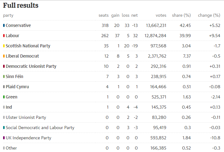
Questions:
We might expect that a party that gets 42.45% of the vote would get 42.45% of the seats. Why is this not the case?
Is that unfair?
Answers:
This could be worked out using a spreadsheet:
| Party | Percentage | Seats | Seats shared using % | How many extra seats? |
| Conservative | 42.45 | 318 | 276 | 42 |
| Labour | 39.99 | 262 | 260 | 2 |
| SNP | 3.04 | 35 | 20 | 15 |
| LibDem | 7.37 | 12 | 48 | -36 |
| DUP | 0.91 | 10 | 6 | 4 |
| Sinn Fein | 0.74 | 7 | 5 | 2 |
| Plaid Cymru | 0.51 | 4 | 3 | 1 |
| Green | 1.63 | 1 | 11 | -10 |
| Ind | 0.45 | 1 | 3 | -2 |
| UUP | 0.26 | 0 | 2 | -2 |
| SDLP | 0.3 | 0 | 2 | -2 |
| UKIP | 1.84 | 0 | 12 | -12 |
| Other | 0.52 | 0 | 3 | -3 |
| 100.01 | 650 |
The 4th column shows what 42.45% of 650 seats is. The final column shows that the Conservatives got an additional 42 seats over and above that amount. This is a result of the 'first-past-the-post' system we use in this country whereby each constituency is sorted out separately. The Green Party got a few votes in many constituencies. Other countries (including elections for the Scottish Parliament) have voting systems that are more proportional than that.
What do these graphs tell us? Are their titles accurate?


Answer: They do seem to be accurate.
What is going on here?

Answer: This is difficult to interpret. Are these the changes in the percentage values, or are they the percentage change in the percentages? What else can you see in these?
Sources:
http://lordashcroftpolls.com/2017/06/result-happen-post-vote-survey/#more-15330
http://www.telegraph.co.uk/news/0/general-election-2017-results-analysis-theresa-may-lost-majority/
https://www.theguardian.com/politics/ng-interactive/2017/jun/08/live-uk-election-results-in-full-2017
https://www.theguardian.com/politics/ng-interactive/2017/jun/09/theresa-may-election-gamble-fail-conservatives-majority-polls
Guardian, via: https://twitter.com/geoffwake1/status/873664246030225408/photo/1
Financial Times, via: https://twitter.com/GoodwinMJ/status/873469390641090560/photo/1
