Sunday, 28 August 2016

Quibans 36: School exclusions for assault

This is a lightly rewritten article from the Cambridge News website:

Primary school exclusions on the rise for 'violent behaviour'
More primary school pupils in Cambridgeshire are being excluded from school for violent behaviour, it has emerged.  The figures are especially pronounced amongst primary school pupils, with exclusions for violent behaviour towards adults and other pupils rising.
A spokesman for Cambridgeshire County Council said: “Schools are usually very safe places for pupils and serious incidents of violence against pupils or staff are rare.”
The spokesman said that, while the number of exclusions for violent behaviour had gone up, this may be down to […].
Pupil assaults on an adult
2011/12:  118 primary and 65 secondary
2012/13:  146 primary and 49 secondary
2013/14:  189 primary and 72 secondary
2014/15:  201 primary and 76 secondary
2015/16:  319 primary and 66 secondary
Attacks on other pupils
2011/12:  64 primary and 319 secondary
2012/13:  104 primary and 271 secondary
2013/14:  127 primary and 273 secondary
2014/15:  110 primary and 242 secondary
2015/16:  162 primary and 276 secondary


Possible ways to use this:
First of all, are the claims in the article reasonable ones?
1)  Are “exclusions on the rise”?
2)  Are “serious incidents of violence against pupils or staff rare”?
3)  What else do the figures tell us?
4)  What is wrong with the line: “Pupil assaults on an adult”?
5)  What reasons might the spokesman have given for the rise in exclusions?


Possible ways to approach these questions:
1)  The first of these could be explored by drawing a graph.  What sort of graph might be useful?
Here is the data (in Excel):


And here are some of the graphs I got Excel to draw.  It would be good to ask students to comment on the usefulness of each method of data presentation.


Here are my thoughts about each one:
Line graph:
This is clear.  It shows how the data changes over time.  The lines are not particularly relevant (halfway along a line has no meaning) but this helps our eye to see the pattern.

Stacked column:
These are often used in the media but I think they are unhelpful because the only one it is easy to compare over time is the lowest one.  Is the top part of each bar getting bigger or not?  It is difficult to tell!

3D pie chart:
Only shows the data for one aspect (the number of primary assaults on an adult (so we would need three other graphs).  It shows how the proportion of assaults has changed over the years, but takes the whole pie as being worth all of the assaults on adults over those five years.  The 3D nature of the graph is not helpful …

Clustered column:
This shows all of the data clearly.  If you join up the top of each bar of the same colour you roughly get the line graph.  You can see clearly which ones are going up and which are going down, how much they are doing so and also the relative proportion of assaults in the two age-groups.

Scatter:
Very similar to the line graph (the x-axis wouldn’t behave as I wanted it to!) but without the lines to guide the eye.

100% stacked column:
Like the pie chart, this shows proportion rather than numbers but in a less useful way than the pie chart.  It doesn’t help us to see whether the number of assaults has changed, just how they are distributed.

Those graphs that are useful do seem to show an increase.  (This could be expanded on further.)

2)  To know whether assaults are rare we probably need to know how many school-children there are in Cambridgeshire.  This is ripe for Fermi estimation!  I will assume that the population of the UK is about 70 million and that there are about 50 counties.  Cambridge is clearly not as big as London and other large cities, so I guess that Cambridgeshire has about 1% of the population of the country as a whole.  There are more younger people than older people, so I will estimate that about a fifth of the population are of school age.  70 million x 1% divided by 5 = 140,000 pupils.  (Google suggests the actual number is close to 80,000 pupils, which puts my estimate in the right order of magnitude.  There are likely to be lots of other ways to estimate this.)
There were 823 exclusions for assault in total in the most recent year.  Comparing this to 80,000 pupils who should be attending school for 190 days each year and we get 54 assaults per million school days.  This seems rare to me.

3)  The data also shows us that there are more primary assaults on teachers, whereas at secondary school they are more likely to be on other pupils.

4)  We don’t know how many assaults actually take place because the figures given are for the number of exclusions from school for assault.  Less serious assaults may not be punished in this way, different schools might respond differently, etc.

5)  Here are the full reasons given by the spokesman:
The spokesman said that, while the number of exclusions for violent behaviour had gone up, this may be down to an increase in the number of pupils attending schools, meaning the proportion of exclusions was actually going down.  He added: "Primary schools appear to have reported increases in incidents and this is a matter of concern. However, this may be as a result of better recording of incidents, a change in pupil behaviour, an increase in pupil numbers or a change in teaching practices and expectations."


Source: http://www.cambridge-news.co.uk/primary-school-exclusions-on-the-rise-for-violent-behaiour/story-29658900-detail/story.html

Saturday, 30 July 2016

Quibans 35: Copper coins

From the Daily Telegraph:

Disgruntled parent pays £60 school attendance fine for taking child on holiday in pennies

After taking his son out of school for a holiday, this man received a £60 fine from local authorities.

Rather than take the easy route, he changed £60 in cash into 1 and 2 pence pieces and proceeded to pour them over the reception desk of the local council office.


This story gives some quick and interesting Quibans opportunities.  Here are some ideas:
1) If he used 4,724 coins, how many 1p coins and how many 2p coins were there?
2) What is the smallest number of coins he could have used?
3) What is the biggest number of coins he could have used?
4) If we know the number of coins, how can we easily work out how many were 1p or 2p?
5) Is it possible to carry £60 worth of 1 and 2 pence pieces?
6) What was the weight of the coins?
7) If the coins were stacked up, how high would the stack be?

Answers and other information:
1) I prefer to answer questions 2, 3 and 4 first and then come back to this one.  I think it is still worth asking this question first, though.  
2) 3000 x 2p = 6000 pence.  It says that 1p coins were used too, so presumably 3001 is the smallest number of coins that could have been used.  (2999 x 2p and 2 x 1p)
3) 6000 x 1p = 6000 pence.  2p coins were used so 5999 coins is the biggest (5998 x 1p and 1 x 2p)
4)  There must be at least 3000 coins (that would be all 2 pence pieces).  Then, every time we change a 2p into two 1p coins we get an extra coin.  
Start with the number of coins and subtract 3000 from it.  This excess is the number of 2p coins that have been changed into 1p coins.  We need to double that number to find the number of 1p coins and subtract it from 3000 to find the number of 2p coins.  Not easy to get your head around (but it is possible to simplify this if you use algebra).
1) 4724 - 3000 = 1724.  This is the number of 2p coins that have been changed into 1p coins.
That leaves 3000 - 1724 = 1276 coins that are 2p.
1724 x 2 = 3448, which gives us 3448 1p coins.  Check that the number of coins adds up to 4724 and that the value makes £60.
5) It feels like it probably will.  60 pound coins would be fine, as would 120 50p coins.  Probably won't be good for your trouser pockets, though.  The source for the article (see below) includes a video of him emptying out the coins. 
6) This is rather neat.  A 1p coin weighs 3.56g and a 2p coin is double that, at 7.12g.  It doesn't matter how the coins are distributed between 1p and 2p - the weight will always be 6000 x 3.56g = 21.36kg
7) This is less straightforward for two reasons.  A 1p coin is either 1.52mm or 1.65mm thick (depending on the date and the composition of the metal used) and a 2p coin is either 1.85mm or 2.03mm thick.  The weights are in the ratio 1:2, so the thicknesses are not.  This means that two 1p coins are thicker than one 2p coin.  
If we assume there are the same number of 2p coins as 1p coins (this could be another question!) then there are 2000 1p coins and 2000 2p coins.  Using 1.9mm and 1.6mm as the thickness of each coin that would give a height of 7 metres.  Good luck with building that!


Source:

Sunday, 10 July 2016

Quibans 34: It's May v Leadsom

May v Leadsom to be next prime minister

From the BBC:

Theresa May and Andrea Leadsom will battle it out to become the next leader of the Conservative Party after Michael Gove was eliminated from the contest.
After the second MPs' ballot, Home Secretary Mrs May finished with 199 votes, Energy Minister Mrs Leadsom 84 and Mr Gove, the justice secretary, 46.
Conservative members will now decide the winning candidate, with the result due on 9 September.
The winner will become the UK's second female prime minister.


Possible questions:
1)            What percentage of the vote did each of them get?
2)            Let’s imagine that Michael Gove came second.  How many of Theresa May’s supporters would have needed to switch to Gove for that to happen?
3)            Let’s imagine that Michael Gove came second.  How many of Andrea Leadsom’s supporters would have needed to switch to Gove for that to happen?
4)            What is the biggest number of votes you could get and still come last?


Source:


Friday, 24 June 2016

Quibans 33: EU Referendum

My Yr 12 class arrived this morning asking whether we would be doing a Quibans based on the Referendum result.  Here is what we did.

They knew that the country had voted as follows:
Leave – 52%
Remain – 48%
They told me the turnout was 72%
I had looked up the total number of people who voted and wrote that up:  33,551,983.

The questions they decided on were:
  1. How many people voted Leave/Remain?
  2. What proportion of the population of the UK voted?
  3. How many eligible voters didn’t vote?

Instead of them giving me answers verbally, we set up a spreadsheet on the board and they came up in turn to do some typing.  This allowed us to talk about how to structure this sort of thing on Excel, and what they should type.  It also helped us explore the difference between typing the number 52 and treating it as a percentage (dividing by 100 when we used it) and typing 52%, which Excel treats as the decimal 0.52

After that I gave them figures for South Cambs (where my school is):
Leave – 39.8%
Remain – 60.2%
93,189 people voted.

They worked out the number who voted to remain/leave:


They pointed out that these can’t be exact because you can’t have 0.78 of a vote.  I then told them the actual figures (shown above). 

First they worked out the accurate percentages, and found that they had been correctly rounded to 1dp here.  This then led to the use of the upper and lower bounds to determine how many people might have voted each way.

Clearly, if the figures for South Cambs ended up being approximate because of rounding issues, then the national figures might also be approximate, so we worked out upper and lower bounds for those.

Finally, I gave them the numbers for Cambridge, where 57,799 voted and 73.8% said ‘remain’ and we worked out upper and lower bounds for that.

So: we did lots of good percentages work (including inverse percentage to calculate the total number of eligible voters), used spreadsheets, considered upper and lower bounds.  Lots of interesting things.

At the very end of the lesson one student was interested in whether the margin of victory was big or not.  Is 52% to 48% a 4% difference, or is it a 2% difference?  Or should you look at the raw figures (1.3 million is a big difference).

Here are some of the links we used:


Thursday, 2 June 2016

Quibans 32: Boring tunnels


From BBC News:
Swiss Gotthard rail tunnel - an engineering triumph

The world's longest - and deepest - rail tunnel opens in Switzerland on Wednesday [1 June 2016].

The Gotthard rail link has taken 20 years to build, and cost more than $12bn (£8.2bn). It will, the Swiss say, revolutionise Europe's freight transport.

The Alps are sometimes described as Europe's natural trade barriers. From Roman times, the routes across them have been mapped, and fought over.

But the plan was ambitious, costly to the Swiss taxpayers who had agreed to pay for it, and fraught with engineering challenges.

A massive 10m (30ft) diameter tunnel-boring machine could, on a good day, dig out 40m of tunnel a day - a world record.

But now the tunnel is ready, and Europe's leaders, including German Chancellor Angela Merkel, French President Francois Hollande and Italy's Prime Minister Matteo Renzi, are all arriving to take a look.

Twin tunnels running in both directions north-south should transport Europe's freight not only much more safely, but much faster. With no danger of collision, trains will race through the tunnel at speeds of up to 250km/h (155mph).

Where older alpine tunnels corkscrewed their way up through the mountains, the new railway line, from Zurich in the north all the way to Lugano in the south, is completely flat and straight.


What can we work out? (It might be useful to explain that there are two 10-metre diameter tunnels and that four boring machines were used – they met up in the middle.) This is one where the students could come up with their own questions. Here are mine:


  1. What exchange rate did they use?
  2. How much of the cost went on salaries? (What assumptions did you make?)
  3. How much did it cost per year?
  4. The Swiss people voted in a referendum to pay for the tunnel: look up how many people there are in Switzerland. How much did it cost them each, per year?
  5. How long is a football field?
  6. What volume of rock was cut on a good day?
  7. Give a lower bound for the length of time to drill the tunnel.
  8. How much freight does a single shipping container hold?
  9. How many times would the copper cable go along the tunnel?
  10. How much concrete is there in the Empire State Building?
  11. My favourite question: how thick is the concrete in the tunnel?


For question 11:
If we assume the tunnel was cut as a circle, diameter 10m and that there is an equal amount of concrete all around (presumably the base should be flat for the trains to run on, so this won't be perfect!) then we have this:


We could use trial and improvement to estimate the thickness of the concrete.
Or we could form and solve a quadratic equation.
Call the thickness of the concrete BC = t.
This gives AC = 5-t
The area of the red annulus is:

Multiply this by the length of the tunnel and this would equal (approximately) the volume of half of the concrete (because there are two tunnels).

Solving this (using the quadratic formula) gives about 1.3 metres.


Source:
http://www.bbc.co.uk/news/world-europe-36416506

Thursday, 26 May 2016

Quibans 31: Olympic preparations

from the BBC News website:

Rio 2016: Key facts ahead of the Olympics

From 5 August Rio will welcome 206 countries to four venues to compete for 4,924 medals across 42 sports... all in just 17 days of action.

A fleet of 21 jumbo jets would be required to fly all 10,500 athletes out to Rio.

Also in attendance will be 315 horses - more than enough horses to fill a Grand National field seven times over.

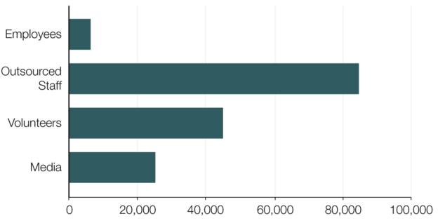
About 140,000 people are needed to host the Games in August. Of those, 90,000 will be employees with a further 50,000 volunteers.


Rio hotel room prices have jumped from an average of £67 to £196 a night, with only 14% of official hotel rooms left available.

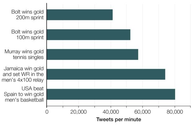
The most tweeted moments of London 2012:

There will be 32 tonnes of dead fish removed from the rowing and canoeing lagoon before the water-based activities take place.  That's the equivalent of 70,548lbs of Brazilian fish stew, enough to feed 47,032 locals their favourite Moqueca dish.

In total, about 7.5 million tickets for the Rio Games will be on sale. By the end of April, 60% had been sold.

Questions:
  1. How many seats are there on a jumbo jet?
  2. How many horses run in the Grand National?
  3. How does the number of media people compare to the number of volunteers?
  4. How many media people does each country send on average?
  5. Why is this not at likely to be the number sent by each country?
  6. What is the percentage price rise of a hotel room?
  7. Usain Bolt ran in the winning 4x100m relay team.  If you combine the tweets involving Bolt, how does this compare to the basketball final?
  8. Why might there have been more tweets about Andy Murray than about the USA basketball team?
  9. 1 ton = 2000 lbs.  1 tonne = 0.98 ton.  What percentage of the weight of fish stew is fish?
  10. How much fish stew does a Brazilian eat in one go?
  11. How many tickets were left at the start of May?
  12. I know that there are gold, silver, bronze medals for each event.  Why is it a surprise to read that there are 4,924 medals?
  13. What is wrong with the numbers about the fish stew?

Answers:
  1. The story claims there are 524 seats on a standard 747.  Using the figures in the article you might assume there are 500 seats.  At 524 seats per plane, on 20 planes you would get 10,480 - leaving just 20 athletes in the final plane!
  2. 315/7 = 45.  You could nearly stage 8 races, because there are actually 40 horses in the race.
  3. Just over half as many.
  4. It looks as if there are about 25,000 media representatives.  Divide this by 206 countries and you get 121.  (Better probably to do 25000/200 to give about 125.)
  5. Presumably small countries won't send as many people.  I assume that many of the events will be filmed by only the official Olympic broadcaster and the footage shared among everyone.
  6. £196/£67 = 2.93, which is 293% of the previous cost.  There has therefore been a 193% rise.
  7. 40,000 + 50,000 + 75,000 = 165,000 (figures are approximate), compared to 80,000.  This is just over twice as much.  
  8. The previous Olympics were in London, so people might have tweeted more about Murray's other matches.  It also says that the graph shows the number of tweets per minute.  We don't know which event prompted the most tweets overall.
  9. 32 tonnes = 31.36 tons = 62720 lbs.  62720 lbs / 70,548lbs = 0.889  This means each pound of stew requires 0.89 pounds of fish (but presumably some parts are thrown away (bones?). 
  10. 70,548lbs / 47,032 = 1.5
  11. 40% of 7.5 million is 3 million.
  12. 4,924 is not divisible by 3.  Some events (such as boxing) have 1 gold, 1 silver and 2 bronze medals.
  13. They are over-accurate.  The figure for the amount of fish is given as 32 tonnes - this will be an estimate and has clearly been rounded.  The number of people the fish stew would feed has been given to 5 significant figures!

Source:

Monday, 2 May 2016

Quibans 30: Footballers' salaries

This could be a brief task, or a longer one.  Beware - there are answers throughout the post.  Teachers might want to extract the images to display rather than projecting from the web.

The initial article comes from the Daily Telegraph:

Chelsea transfer news: 18-year-old Dominic Solanke demands £50,000 per week

Chelsea's inability to bring through a home-grown player since John Terry has left them in a difficult position over the future of teenage striker Dominic Solanke, whose list of demands is understood to include first-team guarantees and a contract worth over £50,000-a-week.

Solanke is one of the most highly-rated young forwards in the country, but the 18-year-old’s Chelsea contract is due to expire in 12 months and talks over a new deal have hit an impasse.

Solanke has made one senior appearance for Chelsea, in the Champions League. The club value him as a highly promising player with the potential to break through, which was reflected in a first professional contract worth £7,000-a-week that was signed in September 2014.

To put Solanke’s alleged demands into perspective, Harry Kane currently earns around £50,000-a-week at Tottenham Hotspur and was collecting £20,000-a-week as recently as January 2015.


Questions:
  1. What is Solanke’s annual salary at the moment?
  2. What does he want it to be?
  3. What percentage pay rise would that be?
  4. What percentage pay rise did Kane receive? 
Answers:

  1. £7,000 x 52 = £364,000
  2. £50,000 x 52 = £ 2.6 million
  3. Rise is (50 – 7) thousand = 43,000. 43/7 x 100% = 614% 
  4. 30/20 is a pay rise of 150%
This can be extended further by using the brilliant website http://www.whatfootballersearn.com

Here is a comparison between arguably the two best players in the world:

What questions could we ask/answer here? Here are some examples:

  • What is their salary per year?
  • How much tax do they pay? (Will need to look up Spanish tax rates)
  • What is the percentage by which Messi out-earns Ronaldo?
  • How much do they each earn per second?
And here are the answers given by the website:

Messi out-earns Ronaldo by (336 – 274) / 274 = 23%

Martin Odegaard was signed by Real Madrid as a 16-year-old. Here is his salary compared with Wayne Rooney’s:

To save us lots of calculator work, it would make sense to create a spreadsheet (optional). It might look something like this, so we could type the weekly salary into a yellow cell:
Now we need to consider rounding issues.

Can we extend it so we can work out how long it will take each of them to afford particular things (such as an iPhone, or a new car)?

Also on the website is a comparison page. The UK average salary is £26,500 per year, so I have typed that in:

I left the website up for about 2 minutes before I took the image. Can you work out the values?

Here is the answer:

Can you work out exactly how long the page was up before I took the image?

(Answer: 124.6 seconds)

I let the page run for a while. When it said this how much had someone on the average wage earned?


Answer:


Final thought: the values given here are the footballers’ basic salaries, as paid by their clubs. They get extra for endorsing and advertising other products too. It is an irony that if I want a pair of top-of-the-range football boots then I need to pay several hundred pounds for them, whereas Rooney et al are not only given boots but are paid to wear them!

Sources:
http://www.telegraph.co.uk/football/2016/04/25/chelseas-dominic-solanke-demands-50000-per-week/
http://www.whatfootballersearn.com/compare/cristiano-ronaldo/vs/lionel-messi/
http://www.whatfootballersearn.com/matcher/?salary=26500&match=false&player_id=852

Quibans 111: How much energy and water do our AI tools really use?

Here is how I used the article below from the Times.  Before showing the article, I started with this information and these questions: Mic...