Tuesday, 21 July 2026

Quibans 111: How much energy and water do our AI tools really use?

Here is how I used the article below from the Times.  Before showing the article, I started with this information and these questions:

Microwaving for 1 second uses 1kJ of energy.
How much energy is used for the following?
1.      Charging an iPhone 17
2.      Watching a 55” TV for an hour
3.      Running a fridge-freezer for a day
4.      Chat-GPT request
5.      AI Image generation
6.      AI Video generation

In silence, individually, they wrote down their estimates, and then I asked them about the way I had set this up.  They told me it was useful to have the first line, so they could compare the other energy uses to that. 

We collected their estimates and they each worked out an average.  One student made estimates that were vastly different from the rest, so some of them decided to ignore that one when finding the mean.

I showed the answers:

Microwaving for 1 second uses 1kJ of energy.
How much energy is used for the following?
1.      Charging an iPhone 17: 57.6 kJ
2.      Watching a 55” TV for an hour: 350 kJ
3.      Running a fridge-freezer for a day: 3600 kJ
4.      Chat-GPT request: 1.2 kJ
5.      AI Image generation: 2.3 kJ
6.      AI Video generation: 3600 kJ

After discussing their answers (they were miles away for the fridge-freezer and for video generation) I asked them to read the article (in printed form), highlighting information they could make use of and any figures they want to check.

Article from The Times, 9 May 2026:

How much energy and water do our AI tools really use?

AI’s problem is not that it is hungry, per se

Digging through articles written during the early years of the internet, you find concerns that can seem oddly familiar. “Dig more coal — the PCs are coming,” screamed a 1999 Forbes editorial. “Somewhere in America, a lump of coal is burnt every time a book is ordered online.”

The warnings scarcely need updating. Today fears of an AI energy apocalypse abound: that video of you eating McDonald’s with Donald Trump is depleting reservoirs; using ChatGPT as your counsellor is overwhelming the grid. Proposals for data centres in southern England have even been rejected over water and energy use fears. How much water and energy does artificial intelligence actually use?

Let us start with water, which has become a point of obsession for AI sceptics. A University of California paper suggests that by 2027 “water withdrawal of global AI is projected to reach 4.2 to 6.6 billion cubic metres” — which is half the water withdrawal of the UK. It sounds alarming. Except water withdrawal includes water that is, well, recycled. The same paper says that AI’s total water “consumption” — water that is evaporated — will be between 0.38 billion and 0.6 billion cubic metres, about a tenth of the original figure.

To add to the confusion, the figure for consumption includes both water that is used to cool data centres (which is drinkable) and water used in the original electricity generation (which is not). So while each basic ChatGPT request to a US data centre consumes about 17ml, just 2ml of it could be used for drinking.

Put all of this together, as the US scientist and blogger Andy Masley has done, and it seems that AI will consume between 0.12 billion and 0.22 billion cubic metres of drinkable water in 2027. In other words, you get the entire world’s AI water use for a mere 1.5 per cent of Britain’s drinking water consumption.

These estimates, too, may now be out of date. Sam Altman insisted last year that ChatGPT used about 0.3ml per query, and a Google Gemini paper comes to a similar estimate of 0.26ml: that’s 20,000 requests for a toilet flush.

What about energy? It depends on what we ask of AI. For both Gemini and ChatGPT, to go by company reports, it’s one kilojoule of energy per text prompt — the equivalent of running a microwave for a second, or about 2 per cent of an iPhone battery charge.

A screenshot of a computer

AI-generated content may be incorrect.

An MIT paper found that basic image generation required 2-4kJ. But videos can be an order of magnitude more energy-intensive: some reports suggest Sora, OpenAI’s text-to-video tool, used 3,600kJ — an hour of microwaving — to make a single video. But the vast majority of us are not making videos every day. Sora was closed down after a few months partly because it used too much energy relative to how few people were using it.

Zoom out and the total data centre electricity bill is modest. Data centres, including those keeping the internet running, use a mere 2 per cent of global electricity, according to the IEA (of which about a quarter is purely for AI). This will rise to 3 per cent by 2030.

A graph of a bar chart

AI-generated content may be incorrect.

To be clear, we are talking about hundreds of additional terawatts of demand. But the extra power needed for AI this decade is dwarfed by the demand from air-conditioning, electric vehicles and industry — 3 per cent of global energy use is incredibly good value for something we spend many hours a day using. What, then, is all the fuss about?

The world needs energy: not just for AI but for air-conditioning, transport and food production. Industry tends to find a way of supplying it. Better technology will also help us use what we have more efficiently. In 1999, according to Forbes, it took 1lb of coal — 1kWh — to transmit 2MB of data to buy a book on Amazon. Today 1kWh can generate a studio-quality video. Supply will need to grow to match AI’s ambitions. But the worry should be directed not at how much AI uses but at where we choose to build the hubs that power it.

Source: https://www.thetimes.com/comment/columnists/article/energy-water-consumption-ai-explained-72cbd0lzj


Here are some possible questions to explore:

Q1: A University of California paper suggests that by 2027 “water withdrawal of global AI is projected to reach 4.2 to 6.6 billion cubic metres” — which is half the water withdrawal of the UK.

What is the ‘water withdrawal of the UK’?

Q2: The same paper says that AI’s total water “consumption” — water that is evaporated — will be between 0.38 billion and 0.6 billion cubic metres, about a tenth of the original figure.

Is it reasonable to say this is ‘about a tenth of the original figure’?

Q3: So while each basic ChatGPT request to a US data centre consumes about 17ml, just 2ml of it could be used for drinking.

What percentage of the water used is drinkable?

Q4: it seems that AI will consume between 0.12 billion and 0.22 billion cubic metres of drinkable water in 2027. In other words, you get the entire world’s AI water use for a mere 1.5 per cent of Britain’s drinking water consumption.

Does the 0.12 and 0.22 billion fit with other figures in the article?

Is the 1.5% figure accurate?

Q5: Using your earlier answers, how much water is used per person per day?

Q6: a Google Gemini paper comes to a similar estimate of 0.26ml: that’s 20,000 requests for a toilet flush.

How much water is used by a toilet flush?

Q7: What about energy? It depends on what we ask of AI. For both Gemini and ChatGPT, to go by company reports, it’s one kilojoule of energy per text prompt — the equivalent of running a microwave for a second, or about 2 per cent of an iPhone battery charge.

Is this correct?

Q8:  Comment on the first graph.  What is good/bad about it?

Q9: An MIT paper found that basic image generation required 2-4kJ. But videos can be an order of magnitude more energy-intensive: some reports suggest Sora, OpenAI’s text-to-video tool, used 3,600kJ — an hour of microwaving — to make a single video.

Is this correct?

Q10: Comment on the second graph.

Q11: On average, how many Chat GPT queries are made per person per day?

Answers

A1: What is the ‘water withdrawal of the UK’?

The midpoint of 4.2 and 6.6 billion cubic metres is 5.4 billion cubic metres.  Double this to get 10.8 billion cubic metres. 

A2: Is it reasonable to say this is ‘about a tenth of the original figure’?

Multiplying the new values by 10 gives 3.8 and 6, which are both close to 4.2 and 6.6, so this is reasonable. [Presumably the evaporated water isn’t lost but will reappear as rain?]

A3: What percentage of the water used is drinkable?

2/17 gives 11.8%

A4: Does the 0.12 and 0.22 billion fit with other figures in the article?

Is the 1.5% figure accurate?

If we find 2/17 of 4.2 and 6.6 (the number of billion cubic metres originally stated as being used) we get 0.49 and 0.78.  This doesn’t seem to be close to 0.12 and 0.22.

Taking Britain’s water consumption to be 10.8 billion (as we found earlier), 1.5% of this is 0.16, which is nicely between 0.12 and 0.22, so it looks good.  This does mean that _all_ of the water extracted in Britain is considered to be drinking water.

A5: Using your earlier answers, how much water is used per person per day?

10.8 billion cubic metres, divided by 365, divided by 70 million people.

1 cubic metre is 1000 litres.  That gives us 10.8 trillion litres in total, which, when divided results in 420 litres per person per day.  (This isn’t just the amount we use for drinking, washing, cooking, etc, but all of the water used by industry, infrastructure, etc.)

A6: How much water is used by a toilet flush?

0.26ml x 20,000 = 5.2 litres

A7: Yes: 2% of 57kJ is 1.14kJ

A8Comment on the first graph.  What is good/bad about it?

We can’t differentiate between the smaller values at all, because of the outliers that are video generation and the fridge-freezer.  But maybe that’s a good thing, because it shows how massively these two dwarf everything else!  To save energy, maybe we need to create fewer AI videos, and change to a smaller fridge?

A full phone charge uses less than a minute of microwaving-equivalent-energy.

Microwaving for an hour (3600 seconds) is the same energy usage as keeping a fridge-freezer on for a full day. 

The TV is 55”.  This is 55 inches, and is a measurement of the diagonal.  That’s equivalent to 1.4 metres.

A9: ‘an order of magnitude’ means multiplying or dividing by 10.  Going from 2-4 kJ up to 3,600kJ involves multiplying by about 1000, so this is three orders of magnitude bigger.

As noted in A8, 3,600kJ is an hour of microwaving. 

A10: Comment on the second graph.

The article was written in 2026, so presumably there wasn’t data for 2025 at that point, and the graph is all a prediction.  It is also a prediction of the _increase_, not of the amount. 

A11: On average, how many Chat-GPT-equivalent queries are made per person per day?

(Some of these will be on other systems and some will be video or images, but I will focus on what happens if they are all Chat GPT requests.)  This is difficult to find, because of the different figures that appear in the article, but here is a possible way to work it out:

About 5.4 billion cubic metres of water are used by AI, with 17ml being required for each query.

Divide 5.4 trillion litres by 0.017 litres and then divide by 8 billion people and by 365 days.  That’s 110 each.

Final comment: The article finishes with Today 1kWh can generate a studio-quality video.

1kWh is 1kW of power being used for 1 hour.  This is 1kJ per second multiplied by 1 hour, which is 3,600 kJ.  This is the figure used in the first graph for generating a video.  Why the sudden switch to kWh?  

Thursday, 31 October 2024

Quibans 110: American eating habits

From the Daily Telegraph

My British mind boggles at American eating habits

Outside a convenience store in Kansas, I got talking to a man eating a “Midwest breakfast”: egg and bacon pizza, accompanied by a 36-ounce soda (containing 120g of sugar) and a pint of “americano”.

According to a 2023 study conducted by the Oxford University information platform, Our World in Data, “the average American buys 3,868 calories a day”. But the significant take-away here (pun intended) is that not all the food that gets bought actually gets eaten. 

According to Feeding America, a nationwide network of foodbanks, around 38 per cent of the country’s food gets wasted every year. That’s 80 million tonnes, or 145 billion meals, valued at a staggering $444 billion.

Additional information.  This could be given to students, or they could be asked to search for it (or could just be told that they don’t have enough information to answer a couple of the questions and will need to work out what additional info they need).

·         According to the NHS website, “As a guide: an average man needs 2,500kcal a day, an average woman needs 2,000kcal a day”.

·         A sugar cube weighs about 4g, and contains 16 calories.

·         The population of the USA is 337 million.


Some possible questions:

1)      How many calories are wasted per person per day on average?

2)      How many tonnes of food is bought every year?

3)      How many meals are eaten per year in the USA?  How many is that per person per day?

4)      What is the weight of one meal?

5)      How much does a meal cost, on average?

6)      What percentage of additional calories above the recommended amount are consumed by the average American?

7)      What percentage of the daily calories for a man are in the “36-ounce soda”?


Answers:

1)      How many calories are wasted per person per day on average?

38% is wasted, so if 3,868 calories are bought per person then we can find 38% of that, which is 1470 calories.

2)      How many tonnes of food is bought every year?

80 million tonnes is 38%, so we need to divide by 0.38 to give 210.5 tonnes (more appropriately rounded to 210 tonnes?)

3)      How many meals are eaten per year in the USA?  How many is that per person per day?

145 billion divided by 0.38 = 381.6 billion.  Divide by 365 and then divide by 337 million, to get 3.1 per person per day.  This suggests that children are included in the figures.

4)      What is the weight of one meal?

80 million tonnes is 80 billion kg. 80 billion kg divided by 145 billion meals gives 0.551724 kg per meal, which is about 550g.

5)      How much does a meal cost, on average?

444 billion dollars divided by 145 billion meals = $3.06 on average.  [Why is it OK for us to use the figures in the article to work out the answers to Q4 and Q5, rather than needing to find the total cost for all of the food?  Both versions work!]

6)      What percentage of additional calories above the recommended amount are consumed by the average American?

38% of the calories bought are wasted, so that leaves 2398.16 (call it 2400 calories) being consumed per person.  If the population were half men and half women then the recommended daily amount would be 2250 (the average of 2000 and 2500), but the inclusion of children would affect that figure.  The average excess is at least 2400 – 2250 = 150.  Then divide by 2250, to give 7%.

7)      What percentage of the daily calories for a man are in the “36-ounce soda”?

120 g of sugar in the fizzy drink, which is 120/4 = 30 sugar cubes!  16 calories in each cube gives 480 calories.  480/2500 = 19.2%

Sources: https://www.telegraph.co.uk/travel/comment/my-british-mind-boggles-at-american-eating-habits/

https://www.nhs.uk/live-well/healthy-weight/managing-your-weight/understanding-calories/

Saturday, 16 March 2024

Quibans 109: Will supermarket sandwich prices really jump?

From the Daily Telegraph

Supermarket sandwich prices to jump

Sainsbury's and M&S supplier warns bigger wage bill will drive up costs

Supermarket sandwiches are to become more expensive as a looming rise in minimum wage puts up the cost of making them.

Greencore, the UK’s biggest sandwich maker, said on Thursday it would need to increase its prices when the National Living Wage increases by £1 an hour in April.

The company produces 779 million sandwiches a year and supplies most of the major supermarkets, including Sainsbury’s, Marks & Spencer and Co-op.

Greencore chief executive Dalton Philips said: “We’re hugely supportive [of wages rising], because if you can get wages moving again, that’s going to ultimately put more money in people’s pockets. But the reality is, on our wage bill, it is a material increase.”

The National Living Wage will rise to £11.44 from April in the biggest cash increase since the minimum wage was created in 1998. Mr Philips said the increase will add around £30m to Greencore’s costs.

He said: “Obviously you do everything you can to mitigate it by operational efficiencies and all the good work that all companies try. But at the end of the day, it’s £30m, and you can’t mitigate it all. And some of that does seep into price rises.”

Greencore employs around 13,600 people across 16 factories in the UK. As well as making hundreds of millions of sandwiches, it makes around 25 million packs of sushi and 132 million chilled ready meals every year.

Supermarkets ultimately set the price of the goods they sell. However, a rise in what Greencore charges may well be passed on to shoppers.

The likely increase threatens to reverse the recent slide in food inflation. Grocery inflation dropped from 7.7pc to 6.7pc last month, according to the British Retail Consortium.

Industry bosses have warned that they face significant increases in costs in the months ahead that threaten to push up prices. As well as the rise in minimum wage, business rates are also set to climb and new border checks will add to costs.

Helen Dickinson, chief executive of the BRC, said earlier this month: “Government should think twice before imposing new costs on retail businesses that would not only hold back vital investment in local communities, but also push up prices for struggling households.”

Mr Philips said despite the cost-of-living crisis, shoppers were increasingly opting for pricier, premium sandwiches.


Friday, 2 June 2023

Quibans 108: Teacher training crisis

From The Times Newspaper:

The over-55s keeping classrooms going amid a teaching crisis

Richard Lewis will be 70 on Tuesday. A former City banker, he plans to ride a motorbike until he is 80 — and be a teacher for as long. He is one of a growing number of over-55s propping up classrooms all over England amid a teacher shortage crisis. It is the only age group in which teacher training recruits have increased over the past year.

Despite rising during the pandemic, the number of teachers being recruited has plummeted in the past year. A total of 28,991 teachers were recruited in 2023, down from 36,159 in 2022, according to the Department for Education. Secondary school postgraduate recruitment is 41 per cent below target.

One factor being blamed for the collapse in new trainees coming forward and the high rate of new teachers quitting is what is being called the work-from-home factor. Younger people are shying away from a job in Britain that is still five days a week “in the office”.


Questions:

Q1) Critique the first graph.  What is good about it?  What is bad about it?

Q2) How many years are included in each of the age bands (apart from the first and last)?

Q3) What is the percentage change from 2021/22 to 2022/23 for each age band?

Q4) What is the percentage change from 2019/20 to 2022/23 for each age band?

Q5) What percentage of the people in 2022/23 are in each age band?

Q6) The headline reads: “The over-55s keeping classrooms going amid a teaching crisis”.  Use data/calculations to justify the headline. 

Q7) Use data/calculations to help you to write (and justify) a completely different headline.

Q8) What do you think of the headline that was actually used in the newspaper?

Q9) In the second graph, explain what happened in 2021/22.  What do the three points mean?

Q10) Tell the ‘story’ of the secondary line in the second graph.

Q11) The article states: “Secondary […] is 41 per cent below target.”  Where can this be seen on the graph?

Q12) Why isn’t the ‘total’ dot exactly halfway between the primary one and the secondary one? 

Q13) Using 2022/23, work out the ratio of primary trainee teachers to secondary trainee teachers.


A1) Critique the first graph.  What is good about it?  What is bad about it?

The most unusual/surprising thing is that it goes from right to left!  The most recent year is on the left.  Does that change students’ perceptions of what is happening? 

Is it clear that this shows those who have joined initial teacher training courses, and isn’t the number of new teachers that there are each year?

The age groups are all the same size, except for the first and the last ones.  Generally, people start a teacher training course after completing a degree, so it would be rare to be under the age of 21, making the bottom group 21 – 24 rather than 20 – 24.  The oldest group covers more than 5 years.

Is the recent year shown in orange to highlight it, or because it is below what it should be?

Would it be useful to have a total at the bottom of each column?

The final ‘bar’ for each year is actually a bar (and not a header/footer).  The numbers appear on it for aesthetic reasons.

The bars are useful: they make it easy to see how things are changing (both going up the ages, and across the years). 

The years are academic years.


A2) How many years are included in each of the age bands (apart from the first and last)?

“25 – 29 years” consists of 5 years.  The way we use ages is that someone is 29 until the day they turn 30.  We don’t round off as we usually do.  This, then includes everyone who is aged 25, 26, 27, 28 and 29, which is clearly 5 year groups.


A3) What is the percentage change from 2021/22 to 2022/23 for each age band?

(I have put the two columns in the sensible order, unlike in the article!)


A4) What is the percentage change from 2019/20 to 2022/23 for each age band?


A5) What percentage of the people in 2022/23 are in each age band?


A6) The headline reads: “The over-55s keeping classrooms going amid a teaching crisis”.  Use data/calculations to justify the headline.

Here’s a possible answer:

“If you look at the percentage change from 2021/22 to 2022/23 (the answer to Q3) you can see that every age group saw a percentage decrease, except one.  The percentage decrease was between 15% and 27% (which is more than a quarter).  The only group not to see a decrease was the group aged 55 and over, which increased by nearly 4%.”


A7) Use data/calculations to help you to write (and justify) a completely different headline.

There are lots of different possibilities.  Here are a couple of ideas:

·         Number of new teaching recruits falls by a fifth.  (The total from 2021/22 to 2022/23 fell by 19.8%, which is roughly 20%, which is a fifth.)

·         The under-25s keeping classrooms going amid a teaching crisis. (Compared to 2019/20, which means they signed up before the pandemic started, the number of new recruits in every age group has fallen.  The lowest fall was in the under-25s, which is a good thing, because the vast majority of new teachers are younger than 25.  In 2022/23 over 3/5 of the new teachers fell into this group.)


A8) What do you think of the headline that was actually used in the newspaper?

Rubbish!

The number of over-55s training to teach is 160, which is 0.6% of the total.  This is a hundredth of the under-25s.  The increase from the previous year is indeed 3.9%, but that’s an increase of only 6 people.


A9) In the second graph, explain what happened in 2021/22.  What do the three points mean?

The yellow dot for 2021/22 shows that primary recruited ~132% of their target, so they got 32% above the number required. 

The light-blue dot for 2021/22 shows that secondary recruited ~78% of their target, so they got 22% below the number required. 

The dark-blue dot for 2021/22 shows that overall recruitment (primary and secondary together) was ~96% of their target, which is 4% below the number required. 


A10) Tell the ‘story’ of the secondary line in the second graph.

From 2015 onwards it is more or less the same percentage of the target (just over 80%), until 2020/21, which was during the pandemic.  Then it increased to just over 100% of target for a year, before dropping back down to the usual level in 2021/22 and massively below that in 2022/23.

(Maybe other jobs weren’t hiring during the pandemic, so more people decided to train to be a teacher.)


A11) The article states: “Secondary […] is 41 per cent below target.”  Where can this be seen on the graph?

The light-blue dot for 2022/23 is at 59%, which is 41% below 100%.


A12) Why isn’t the ‘total’ dot exactly halfway between the primary one and the secondary one? 

This would only be the case if there were equal numbers of primary and secondary teachers.  The total line is always closer to the secondary one, indicating there must be more secondary teachers than primary.  (Primary teacher training courses generally cover Early Years (the year before Year 1) and then Years 1 to 6, which is 7 year-groups, while secondary courses generally go from Year 7 to Year 13, which is also 7 year-groups, does this mean that average class sizes in secondary schools are smaller?  Or that secondary teachers are more likely to leave teaching so more new teachers are required to replace them? Or … ?)


A13) Using 2022/23, work out the ratio of primary trainee teachers to secondary trainee teachers.

From the graph, the figures appear to be:

Secondary 59%

Primary 94%

Total 72%

If the ratio of primary to secondary is 1 : n, where n is more than 1, we have (94+59n)/(1+n) = 72

Rearrange to get 94 + 59n = 72 + 72n

Solving this gives 22 = 13n, so n = 1.69

The ratio is therefore 1 : 1.69


Source: https://www.thetimes.co.uk/article/the-over-55s-keeping-classrooms-going-amid-a-teaching-crisis-gt3w2269c


Thursday, 27 October 2022

Quibans 107: Shrinkflation revisited

This is taken from a Daily Telegraph article (with paragraphs removed to save space).

Shrinkflation is speeding up at an alarming rate

The Office for National Statistics says food price inflation has risen to 15 per cent. Er, have they been to a supermarket lately? I reckon the cost of basic foodstuffs is up nearer 20 per cent.

And shocking prices are not the only issue. I picked up some dried mango, my daughter’s favourite, to put in the basket yesterday and I thought there must be a hole in the packet because it contained so few pieces. Nope. Same size packaging, half the content.  They call it “shrinkflation” – packaging and price stay the same size while contents diminish – and it’s been happening for years. But, if I’m not mistaken, shrinkflation is now speeding up at an alarming rate. 

The metric system makes it a lot easier for manufacturers to con consumers – 1lb down to 14oz would be picked up quickly, but 454g to 425g is less noticeable. So, Sensodyne toothpaste is the same price, but tubes are now 75ml instead of 100ml. That’s a 25 per cent price increase. What used to be a 2kg packet of Birds Eye frozen peas has gone down, first to 1.5kg, then 1.3kg and is now a 1.2kg packet.

SEVERAL FOOD ESSENTIALS HAVE SOARED IN PRICE

 Price changes between September 2021 and September 2022


Questions

Q1) Is there any contradiction in the first paragraph?

The Office for National Statistics says food price inflation has risen to 15 per cent. Er, have they been to a supermarket lately? I reckon the cost of basic foodstuffs is up nearer 20 per cent.

Q2) What is the percentage change from 1lb to 14oz?

The metric system makes it a lot easier for manufacturers to con consumers – 1lb down to 14oz would be picked up quickly, but 454g to 425g is less noticeable.

Q3) What is the percentage change from 454g to 425g?

Q4) Why has the author chosen 454g?

Q5) Convert 425g to ounces.

Q6) What error has the author made regarding the weights?  Correct the sentence.

Q7) What is the error in the toothpaste example?  Correct the sentence.

So, Sensodyne toothpaste is the same price, but tubes are now 75ml instead of 100ml. That’s a 25 per cent price increase.

Q8) Calculate the missing figures in the table.  Then compare them to the original version, shown below in the answers.  Comments?

Q9) Birds Eye frozen peas are mentioned.  Here they are, as available at Tesco’s.  Which one is the best value?


.

.

.

.

.

.

Answers

A1) Is there any contradiction in the first paragraph?

No.  “Food price inflation” could have risen to 15% while the “cost of basic foodstuffs” has increased by more than this, because food price inflation includes more than just the basics.

(And presumably the government’s Office for National Statistics is a more reliable source than Someone Who Goes to a Supermarket.)

A2) What is the percentage change from 1lb to 14oz?

1 lb = 16oz.  So the percentage change is 2/16 = 12.5%

A3) What is the percentage change from 454g to 425g?

The percentage change is 29/454 = 6.4%

So it is obvious that the first change would be more noticeable, because it is so much bigger!

Q4) Why has the author chosen 454g?

454g is equivalent to 1 lb.

A5) Convert 425g to ounces.

425/454 x 16 = 14.97797.  So it is 15 ounces.

A6) What error has the author made regarding the weights?  Correct the sentence.

They have tried to say that the same weight reduction is easier to spot in the Imperial system than in the metric system.  Unfortunately, they have gone from 16oz to 14oz in Imperial units and 16oz to 15oz when converted to metric units.  Oops!

It could be corrected to be either of these:

* 1lb down to 15oz would be picked up quickly, but 454g to 425g is less noticeable.

* 1lb down to 14oz would be picked up quickly, but 454g to 397g is less noticeable.

A7) What is the error in the toothpaste example?  Correct the sentence.

The volume of toothpaste has gone down by 25%, but that is not the same as a 25% increase in price.

To find the equivalent price increase, we need to find out what percentage of the new volume we would need to buy to get the original amount of toothpaste.  We would need 1 and 1/3 tubes of 75ml toothpaste to make 100ml.  That is the same as a 33 1/3 % increase in price.

It could be corrected to be: 

So, Sensodyne toothpaste is the same price, but tubes are now 75ml instead of 100ml. That’s a 33 per cent price increase. 

A8) Calculate the missing figures in the table.  Then compare them to the original version, below.  Comments?

You will not have got exactly the same numbers.  Nothing is more than a penny away from what you expect, though, so anything further away than this has an error.

What is going on with the sugar and the rice?  Presumably the prices are not exact but have been rounded.  How it this possible?  They must be average costs across lots of different shops.

A9) Birds Eye frozen peas are mentioned.  Here they are, as available at Tesco’s.  Which one is the best value?

Working out the cost per kg, or the cost per g is a good way to do this.

Strangely, it’s not the largest packet!


Source: https://www.telegraph.co.uk/columnists/2022/10/26/shocking-prices-shrinking-sizes-does-government-need-stop/


Thursday, 29 September 2022

Quibans 106: Which animals could you beat in a fight?

This is based on a survey carried out by the (usually reputable) polling organisation YouGov.  Here is my suggestion of how to use this as a lesson.

The lesson materials (but not the answers) are also available on this PowerPoint

I gave out a questionnaire first:

Fight!

Which of the following animals, if any, do you think you could beat in a fight if you were unarmed?

Rat


Lion


House cat


Gorilla


Medium sized dog


Chimpanzee


Large dog


King Cobra


Kangaroo


Elephant


Eagle


Crocodile


Grizzly bear


Goose


Wolf


Which order do you think people will put them in overall?

(easiest to beat = 1, hardest = 15)


Collect the data as a class.  How representative is the sample?  Will our data reflect the national data well? 


Here is an article from Newsweek (a US news magazine): 

A Surprising Number of Americans Think They Could Beat Wild Animals in a Fight

A 2021 YouGov survey had revealed that a surprising number of Americans think they could win an unarmed fight against a variety of wild animals.

Reassuringly, the percentage of Americans confident about winning an unarmed fight goes down, the larger the animal.

Most Americans—72 percent—believe they could beat a rat in a fight, which despite the rodent's large teeth, could perhaps be feasible. However, some foolhardy people still believe they stand a chance against some of the scariest animals in Animal Kingdom, such as the grizzly bear, and the crocodile.

It is a criminal offense to hurt animals. Animal cruelty is a federal crime. The animals mentioned below are generally of no threat to humans unless provoked.

Could You Beat a Bear in a Fight?

Americans are not confident in their abilities to beat a grizzly bear in a fight. Only 6 percent believe that they could win. Grizzly bears can stand at a height of up to 8 feet, and the males can weigh up to 1,700 pounds.

They are faster, stronger, better equipped with both teeth and claws, and they have a much higher level of protection with thick fur, skin, fat layers and thicker stronger bones. So both offensively and defensively we are no match for them.

Could You Beat a Crocodile in a Fight?

A bold 9 percent of Americans think they could take on a crocodile, the biggest reptile in the world. Some can reach 20 feet. Males over 17 feet weigh from about 1,760 pounds to 2,200 pounds. Considering that one of the strongest men in the world, Iranian weightlifter Hossein Rezazadeh, was able to lift only 579 pounds, you can see what you're up against.


Possible questions:

Q1) How does your personal order compare with the national figures for the USA?

Q2) How does the class percentage compare with the USA figures?

(What types of correlation might be useful here?)

Q3) In the Newsweek article, what is unusual about the units that are used? 

Q4) Covert the units to metric.

Q5) How do you think people in the UK will compare to those from the US?


Answers:

A1&A2) It may be useful to use Spearman’s Rank Correlation Coefficient for Q1 (to compare the rankings of the animals), and the PMCC for Q2 to compare the percentages.  It seems unlikely that the percentages will be close, because in class we have such a small sample size, and it may not be a representative sample because everyone is roughly the same age and lives in roughly the same place.

A3)  The article says Grizzly bears are 8 feet tall and weigh 1700 pounds.  The units are what we would call “imperial units” and which are used in the USA.  They call them “units”, “British units”, or “customary units”.

A4)  1 foot is approx 30cm, so 8 feet is about 2.4m. 

1700 pounds (1700 lb) can be converted as follows:  There are 14 pounds in a stone and 1 stone is about 6.4kg.  Alternatively, use 2.2 lb = 1kg. 

The bear is about 120 stone (!), or 770kg.

For the crocodile, 20 feet is about 6 metres, and 2200 lb is approx 1000kg, which is 1 tonne. 

Hossein Rezazadeh can lift about 260kg.


Now show the table below from the original YouGov data:

Q6) Which figure was used in the graph?


A6) The 72% was used.  (Is it reasonable to lump the ‘don’t knows’ in with ‘I could not beat…’?)


Here is one graph that was tweeted out:


Q7) Comment on the graph and the data.


A7)  Comments might include:

About twice as many Brits were asked compared to Americans.  The data was collected a month apart.   Brits were generally much more cautious!  For a rat the difference appears to be about 6%, and for a lion the difference appears to be about 6%.  But that means only a small fraction more Americans thought they could beat a rat, but that about four times as many thought they could be a lion. 

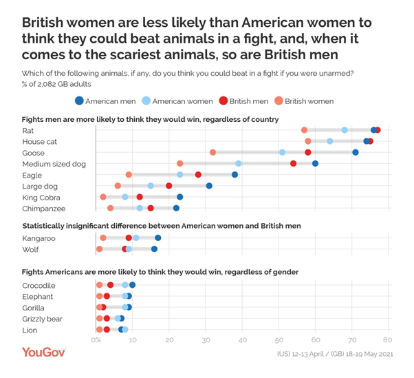
Here is a final graph about the same original data:

Q8) Comment on this graph

A8) Comments might include: Men are always more confident than women from the same country … except for the lion.

As the headline suggests, for the more dangerous animals, US women are more confident they could win than GB men.

Compare the cat and the rat data with the previous graph.  The GB men are the most confident group overall.  Does this change the way we might interpret the previous graph?


Final thoughts: We could return to the class data that was collected at the start of the lesson.  This Quibans shows the importance of: the sample size, the sample that is used and the way the data is analysed and presented. 

https://www.newsweek.com/surprising-americans-beat-wild-animals-fight-experts-1691793

https://yougov.co.uk/topics/society/articles-reports/2021/05/21/which-animals-could-britons-beat-fight

https://docs.cdn.yougov.com/mygotrlqrg/YouGov%20-%20Humans%20vs%20animals%20UK.pdf

https://docs.cdn.yougov.com/07vgk5e81j/YouGov%20-%20Human%20vs%20animal%20fight.pdf


Quibans 111: How much energy and water do our AI tools really use?

Here is how I used the article below from the Times.  Before showing the article, I started with this information and these questions: Mic...