Saturday, 4 May 2019

Quibans 88: Bottled water

I started by giving out just this paragraph from the Guardian article that follows:
Imagine laying out half-litre bottles on the pitch at Wembley Stadium. You could fit ### bottles on the grass, packed into a tight grid. Now imagine building up layers of bottles, covering the same area, to build a tower. To contain all the bottled water we buy each year [in the UK], you would end up with a ###-metre skyscraper.
There are some nice Fermi estimations required here.

What are the dimensions of a football pitch? What are the dimensions of a water bottle? How many bottles are used in this country in a year?

Then we need to convert some units and carry out the calculations, not forgetting to round off sensibly.

The students worked in groups. A typical estimate for the size of a football pitch was 110m by 60m. Some measured their water bottles (!) and found a diameter of about 6cm and a height of 20cm.

If working out the area covered by the pitch and by a bottle we need to be careful when converting units (10,000 cm2 = 1m2). We also need to decide what “packed into a tight grid means” (we took it to mean a rectangular grid). The easiest way is to work out how many bottles fit along each side of the pitch and then to multiply these. These figures gave us 1.8 million (pleasingly close to the 1.7 million in the article). Other estimates in the room varied between 1.6 million and 2.8 million.

Working out the height is more difficult. If everyone in the country has one bottle per week then that would give us about 1.7 billion bottles per year. That would need to be stacked 1000 rows high, which means a height of about 200m. In fact the article says it’s 2.2 billion _litres_ per year (each bottle holds 500ml), so we have underestimated the answer.

I then gave out a fuller version of the article (below) and asked what things they could work out.

If we care about plastic waste, why won’t we stop drinking bottled water?
Sun 28 Apr 2019

For all the innovation and choice that define the food and drink industries, if you want to make money, you could do a lot worse than bung some water in a bottle and flog it. A litre of tap water, the stuff we have ingeniously piped into our homes, costs less than half a penny. A litre of bottled water can cost well over a pound, especially for something fancy that has been sucked through a mountain.
Yet the bottled water market is more buoyant than ever, defying the plastics backlash inspired by stricken albatrosses on the BBC’s Blue Planet, and a broader, growing sense that something has to change.
Sales in the UK were worth a record £558.4m in the year to last November, an increase of 7%, according to the latest figures from the market analyst Kantar. Separate data from the analysts Nielsen show that last year we guzzled more than 2.2bn litres of bottled water, including “take-home” and “on-the-go” products. That’s an annual rise in volume of 8.5%.
Imagine laying out half-litre bottles on the pitch at Wembley Stadium. You could fit 1.7m bottles on the grass, packed into a tight grid. Now imagine building up layers of bottles, covering the same area, to build a tower. To contain all the bottled water we buy each year, you would end up with a 514-metre skyscraper – 200 metres taller than the Shard.
Hope is not entirely out of reach. That plastic skyscraper conceals attempts in the bottled water industry to change. If nothing else, the rate of growth has begun to ease (sales were up 7% in the year to November 2018, compared with 8% the previous year).
But even if large numbers of us are quitting bottled water because of care for the environment, others are taking it up. The introduction of the “sugar tax” on juices and fizzy drinks has pushed more people to bottled water, while health awareness has boosted its desirability. Kantar says tap water consumption is growing at roughly the same pace (we still drink almost three times as much tap water as bottled water).
So the plastic tide only creeps higher. The industry is quick to point out that all its bottles are recyclable. “But collection rates are, at the most generous estimates, 56%, so the actual recycling rate will be lower than that,” Chetan-Walsh says. And while bottles may be recyclable, very few are made of recycled plastic. Highland Spring launched recycled half-litre “eco” bottles alongside its standard bottles in January; Evian has vowed to use only recycled plastic across its range by 2025.
Kinvara Carey, general manager of the Natural Hydration Council, an association of the biggest bottled water manufacturers, cites a survey in which people were asked what they would do if bottled water were not available. “Forty-four per cent would buy another drink, which is not great, 14% would go without and 4.5% said they would find a fountain,” she says. “The choice is important.”

We can work out things like:

1) The cost of a litre of bottled water
2) How the price has changed in the past year
3) What the amounts were last year
4) How many bottles are recycled
5) The volume of landfill taken up by bottles
6) Why the percentages in the final paragraph don’t add up to 100%
7) How much water each person drinks each day

Friday, 26 April 2019

Quibans 87: McDonald’s straws


I gave the article below (from the BBC website) to my Yr 12 class and asked them what they could work out.  They had some great ideas (which are shown below the article), largely because we have been working on this sort of thing throughout the year.  If you wanted to use this with a class that isn’t used to working in this way then the ideas my class came up with could be turned into questions to ask.

McDonald's plastic straw petition: Call to ditch paper straws

24 April 2019

McDonald's is being called on to stop its roll out of paper straws in the UK and Ireland, amid claims that they "dissolve" in drinks.

The fast food giant is switching from plastic to paper straws at their 1,361 restaurants after customer pressure. An online petition calling for a return to plastic straws has so far garnered more than 35,000 signatures.

McDonald's say they are "doing the right thing" while a supplier said customers need to "compromise". The restaurant chain supplies 1.8 million straws to its four million UK customers each day.


Things my class worked out:
  • 35,000 people have signed the petition.  That’s less than 1% of the people who visit McDonald’s in one day.
  • About 6% of the population of the country go to McDonald’s each day.
  • On average each restaurant uses 1323 straws per day.  [We talked about rounding this off more appropriately – and decided that 1300 is probably better.]
  • Just under half (45%) of customers use a straw.  This might be because some people don’t have a drink, or have a hot drink, or have juice without a straw.
  • There are 1.46 billion visits to McDonald’s in the UK and Ireland each year.  [Better as 1.5 billion?]  We know this can’t be 1.5 billion different people because that would be about a fifth of the population of the planet!  On average, that’s 22 visits per year per person, which is equivalent to about two visits per month.  Maybe half the population go once a week and the other half never go? 
  • A straw weighs about 0.42g.  That means 756kg of straws per day.  Over the course of a year that’s the weight of 3600 adults.


Saturday, 15 December 2018

Quibans 86: Recycling Ferrero Rocher


This is interesting because it contains an error, a lack of clarity and something misleading.  Perfect for a Quibans!

Article from the Daily Telegraph:
Ferrero Rocher shamed as Christmas chocolates with the least recyclable packaging 
12 DECEMBER 2018 
Ferrero Rocher has been named and shamed as the Christmas chocolate box with the least recyclable packaging. 
The vast majority (89 per cent) of the packaging in a 359g Ferrero Rocher Collection box may be destined for landfill as it is made from non-recyclable plastic and foil, a study by consumer group Which? found.
By contrast the most recyclable chocolate boxes were Waitrose Christmas Chocolate Favourites 240g which is 96.3 per cent recyclable) Cadbury's Milk Tray, which is 92.5 per cent easily recyclable. The second least recyclable packaging was for Marks & Spencer's The Big One Selection 600g, which is 71.4 per cent recyclable. 
In addition Which? analysed chocolate boxes for their packaging to chocolate weight ratio, and found boxes of Ferrero Rocher Collections had by far the highest. 
Nearly half of the weight of a 359g Ferrero Rocher Collection box is made up of packaging (42.4 per cent), with the rest constituting (67.6 per cent) the chocolates themselves, it found.  
The boxes with the highest proportion of chocolate weight were Marks & Spencer's The Big One Selection 600g (just 8.5 per cent packaging), and Lindt Lindor Assorted Mix 384g (just 11.5 per cent packaging), the study showed.  

Questions:
1)      What is the error?
2)      The lack of clarity is that ‘359g’ is the weight of the chocolate (and nuts, etc) in the box.  The packaging weighs more on top of that.  42.4% of the total is the packaging, so what is the weight of packaging?
3)      The misleading part is that an implication of the two mentions of M&S is not followed up.  What is going on there?

(Answers are below.)

Further info:
Here are screenshots of the tables from the Which? report:


Here it is as a single table (to be pasted into Excel?)
Chocolate
Official weight (g)
Weight in packaging (g)
Packaging weight (g)
Percentage packaging 
Percentage easily recyclable
Cadbury's Heroes
660
808
144
17.80%
88.90%
Cadbury's Milk Tray
360
470
106
22.60%
92.50%
Cadbury's Roses
660
810
144
17.80%
90.30%
Chocolate Treats By Sainsburys
650
806
154
19.10%
88.30%
Ferrero Rocher Collection
359
642
272
42.40%
11%
Lindt Lindor Assorted Mix
337
384
44
11.50%
90.90%
Marks & Spencer The Big One Selection
600
662
56
8.50%
71.40%
Mars Celebrations
650
812
150
18.50%
90.70%
Mars Malteaser Teasers
275
364
70
19.20%
88.60%
Morrisons Mega Mix
1050
1216
162
13.30%
81.50%
Nestle Quality Street
720
846
130
15.40%
83.10%
Thorntons Continental Selection
284
408
120
29.40%
86.70%
Waitrose Christmas Chocolate Favourites
240
356
108
30.30%
96.30%

Additional questions:

4) What should happen when you add up the Official Weight and the Packaging Weight columns?
5) Do any of them mis-state the amount of chocolate they contain?
6) Work out the percentage of the Total Weight for each product that cannot be recycled. How does M&S compare?


Answers:

1)      The error is that 42.4% plus 67.6% doesn’t equal 100% (and it should).  The former figure is correct (as seen in the Which? tables).
2)      The chocolate in the Rochers are 57.6%, so when we divide 359g by 0.576 we get the total weight (623g) and this leads to a packaging weight of 264g.  This doesn’t agree with the figures from Which? because there is slightly over 359g of choc.
3)      M&S may have the second-least recyclable packaging, but there is much less of it, so maybe they have cut down on the packaging overall (which seems like a good thing: just because something is ‘recyclable’ doesn’t mean everyone will recycle it!).
4)      You should get the ‘Weight in packaging’ column. 
5)      Most of them give us slightly more chocolate than advertised, with only Nestle falling under (but that is presumably only on the single box that Which? tested).
6)      I used Excel to work this out.  38% of the weight of the in-package Ferrero Rocher is non-recyclable, but only 2% of the M&S.  The median was 2%.


Tuesday, 10 April 2018

Quibans 85: Crime and Police figures

From the Cambridge News:


Violent crime in Cambridge has nearly doubled in a decade as police numbers drop
9 APR 2018
Bottom of Form
Violent crime is 90 per cent higher than nine years ago, while police officer numbers have dropped by nearly a tenth.

In Cambridgeshire, there were 15,975 violence against the person crimes reported in the year to September 2017, the latest figures, a ## per cent rise from 8,364 reports in the year ending September 2009. 
However, over the same period, the full-time equivalent number of police officers at the force has fallen by ## per cent, from 1,438 in September 2009 to ## in September 2017, a loss of 106 officers. 
In the past year alone, Cambridgeshire has seen a 30 per cent rise in violent crime, up from 12,316 cases, while police officer numbers have dropped by 1 per cent or seven officers.
A police spokesperson said: “Some of the increases in violent crime can be attributed to improving recording standards and increased reporting of domestic abuse. Most violent crime happens behind closed doors rather than on the streets and the force is working hard to reduce all violent crime.”
Across England and Wales, there was a 20 per cent rise in violent crime, made up of violence against the person, both with and without injury, and homicide, in a year.
In the year ending September 2016, 1.08m violent crimes were reported, rising to 1.29m in the year ending September 2017. 
Compared to the year ending September 2009, when there were 706,859 reports, numbers have more than doubled, a 114 per cent rise, according to figures from the Office for National Statistics, with most forces seeing low in the number of reports in 2012 or 2013.
Over the same period, police forces across England and Wales have lost 22,155 officers, a 15 per cent drop in numbers between September 2009 and September 2017, according to Home Office figures. 
Numbers have dropped by 1 per cent in the past year, from 126,252 full-time equivalent officers in September 2016 to 125,364 in September 2017, a loss of 888 officers.

Questions:
1)      Work out the missing numbers (shown by ## in the text above).
2)      Is the subheading reasonable?  (Violent crime is 90 per cent higher than nine years ago, while police officer numbers have dropped by nearly a tenth.)
3)      Are the other figures in the article consistent?  (Hint: they aren’t!)
4)      How does Cambridgeshire compare to the national situation?


Answers:
Q1)  From the article:
In Cambridgeshire, there were 15,975 violence against the person crimes reported in the year to September 2017, the latest figures, a 91 per cent rise from 8,364 reports in the year ending September 2009. 
However, over the same period, the full-time equivalent number of police officers at the force has fallen by 7 per cent, from 1,438 in September 2009 to 1,332 in September 2017, a loss of 106 officers. 
Checking this:  15975 ÷ 8364 = 1.90997, which is a 90.997% increase.  91% is accurate.
1332 ÷ 1438 = 0.92629, which is a 7.4% decrease.  7% is accurate.

Q2)  The subheading says:
Violent crime is 90 per cent higher than nine years ago, while police officer numbers have dropped by nearly a tenth.
91% has been rounded to 90%, which seems fine.  7% from the article has become “nearly a tenth” in the subhead.  That seems a little out given that it is a way away from 10%.  If both numbers have been rounded to the nearest 10% then …
2009 is eight years before 2017.  The heading says “nine years ago”.  Perhaps they are referring to 2009 being eight years ago from now, but that seems a bit odd, given that we don’t know what the current figures are for 2018.

Q3)  From the article:
In the past year alone, Cambridgeshire has seen a 30 per cent rise in violent crime, up from 12,316 cases, while police officer numbers have dropped by 1 per cent or seven officers.
We have, from earlier in the article, 15,975 violent crimes.  15975 ÷ 12316 = 1.297, which is a 29.7% increase.  30% is fine.  There are now 1332 police officers.  The percentage is 1332 ÷ 1339 = 0.99477, which is a drop of 0.52%.  This has been rounded (unfairly?) to 1% 
A police spokesperson said: “Some of the increases in violent crime can be attributed to improving recording standards and increased reporting of domestic abuse. Most violent crime happens behind closed doors rather than on the streets and the force is working hard to reduce all violent crime.”
This is important.  The article refers to ‘recorded crimes’, so those that aren’t recorded aren’t included and it could be the case that there aren’t in fact more crimes being committed, but rather more crimes being reported.  It would also be worth comparing the increase in crimes to the increase in population (but only for particular age-groups?).
Across England and Wales, there was a 20 per cent rise in violent crime, made up of violence against the person, both with and without injury, and homicide, in a year.
In the year ending September 2016, 1.08m violent crimes were reported, rising to 1.29m in the year ending September 2017. 
1.29million ÷ 1.08million = 1.1944, which is an increase of 19%.  This has been shown as 20%, but it is possible that the accurate value is in fact 20% and rounding issues have intervened.
Compared to the year ending September 2009, when there were 706,859 reports, numbers have more than doubled, a 114 per cent rise, according to figures from the Office for National Statistics, with most forces seeing low in the number of reports in 2012 or 2013.
I can’t make this one work at all.  There are now 1.29 million reports and there used to be 706,859.  Clearly this isn’t more than double.
Over the same period, police forces across England and Wales have lost 22,155 officers, a 15 per cent drop in numbers between September 2009 and September 2017, according to Home Office figures. 
Numbers have dropped by 1 per cent in the past year, from 126,252 full-time equivalent officers in September 2016 to 125,364 in September 2017, a loss of 888 officers.
125364 ÷ (125364 + 22155) = 0.8498, which is a drop of 15%
125364 ÷ 126252 = 0.992966, which is a drop of 0.7%

Q4)  I’ll leave it to you to compare the numbers …


Thursday, 5 April 2018

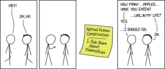
Quibans 84: xkcd

There are lots of classic xkcd cartoons.  This one is a Core Maths problem!


Question:  How many apples have you eaten in your life?


Source: https://xkcd.com/1976/ 

Tuesday, 6 March 2018

Quibans 83: four diagrams

Here are four diagrams I have seen recently.  These form a brief Quibans.

The task: critique/explain/criticise these diagrams.

This was shared on Twitter:

These come from the Daily Telegraph:


Comments/possible answers:

1)  (Image from Twitter - can't recall exactly where.)
There appear to be 180 days in a school year.  The times all work: eg 180 days x 20 mins per day = 3600 mins per year ( = 60 hours).

The number of words read is rather strange though.  The obvious thing would be to assume a constant reading speed and therefore to divide the number of words per year by the number of minutes.  This gives 500 wpm for the first group, 313 wpm for the second group and 44 wpm for the third group.  Maybe you get quicker at reading the more you do, but even so there is a massive disparity here.

The number of books shown is not reasonable either.  The shortest Harry Potter novel (the first one) has about 77,000 words.   The first group would read 23 of these per year, the middle group about 3 and a half and the final group about a tenth of the book.

2)  It seems very strange to have a graph with two lines on it where one is essentially the inverse of the other!  The only people who aren't included on the graph are those who refused to state whether they were for or against Trump.  Other than that, if the number of people who approve goes down then you might be unsurprised if the number who disapprove goes up!

Here I have reflected the red line and placed it on top of the blue line.  A pretty good match!


3)  Here people were asked to recall the food they had eaten that day and the calories were calculated.  Then the actual food they had eaten was used and it was found that many people underestimated massively (forgetting about snacks etc)).
On average, men thought they had eaten 2065 calories (less than the 2500 recommended amount) but had actually eaten 3119 calories.  For women the figures were 1570 and 2393.
The percentage increase is 51% for me (so they ate just over 50% more than they thought) and 52% for women.  It is perhaps surprising that this is essentially the same for both genders.

4)  BMI (Body Mass Index) is calculated by dividing your weight in kg by the square of your height in metres.
There are certain parts of the country that have more overweight people.  What constitutes a 'region'?
It appears, for example, that Cambridge is a yellow section surrounded by a sea of orange.  If Cambridge were considered part of the rest of Cambridgeshire then presumably it would all be orange there.  The way different streets/villages/towns, etc are aggregated makes a big difference!


Sources:
https://pbs.twimg.com/media/DXXcqHkX0AA3M98.jpg
https://www.telegraph.co.uk/business/2018/03/02/world-reacts-horror-trump-delights-hobbesian-trade-wars/
https://www.telegraph.co.uk/science/2018/03/06/britains-new-diet-400-600-600-plan-counter-obesity/

Thursday, 1 March 2018

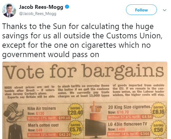
Quibans 82: The Sun and Rees-Mogg

Jacob Rees-Mogg tweeted a photo of an article from The Sun.
Here's screenshot of his tweet:

Rees-Mogg wrote "thanks to the Sun for calculating the huge savings".  Unfortunately they got them wrong.  All of them.

Q1) Explain what they have done wrong.  
Q2) Work out the correct values.

Here is the picture Rees-Mogg posted:


Quibans 111: How much energy and water do our AI tools really use?

Here is how I used the article below from the Times.  Before showing the article, I started with this information and these questions: Mic...