Saturday, 15 December 2018

Quibans 86: Recycling Ferrero Rocher


This is interesting because it contains an error, a lack of clarity and something misleading.  Perfect for a Quibans!

Article from the Daily Telegraph:
Ferrero Rocher shamed as Christmas chocolates with the least recyclable packaging 
12 DECEMBER 2018 
Ferrero Rocher has been named and shamed as the Christmas chocolate box with the least recyclable packaging. 
The vast majority (89 per cent) of the packaging in a 359g Ferrero Rocher Collection box may be destined for landfill as it is made from non-recyclable plastic and foil, a study by consumer group Which? found.
By contrast the most recyclable chocolate boxes were Waitrose Christmas Chocolate Favourites 240g which is 96.3 per cent recyclable) Cadbury's Milk Tray, which is 92.5 per cent easily recyclable. The second least recyclable packaging was for Marks & Spencer's The Big One Selection 600g, which is 71.4 per cent recyclable. 
In addition Which? analysed chocolate boxes for their packaging to chocolate weight ratio, and found boxes of Ferrero Rocher Collections had by far the highest. 
Nearly half of the weight of a 359g Ferrero Rocher Collection box is made up of packaging (42.4 per cent), with the rest constituting (67.6 per cent) the chocolates themselves, it found.  
The boxes with the highest proportion of chocolate weight were Marks & Spencer's The Big One Selection 600g (just 8.5 per cent packaging), and Lindt Lindor Assorted Mix 384g (just 11.5 per cent packaging), the study showed.  

Questions:
1)      What is the error?
2)      The lack of clarity is that ‘359g’ is the weight of the chocolate (and nuts, etc) in the box.  The packaging weighs more on top of that.  42.4% of the total is the packaging, so what is the weight of packaging?
3)      The misleading part is that an implication of the two mentions of M&S is not followed up.  What is going on there?

(Answers are below.)

Further info:
Here are screenshots of the tables from the Which? report:


Here it is as a single table (to be pasted into Excel?)
Chocolate
Official weight (g)
Weight in packaging (g)
Packaging weight (g)
Percentage packaging 
Percentage easily recyclable
Cadbury's Heroes
660
808
144
17.80%
88.90%
Cadbury's Milk Tray
360
470
106
22.60%
92.50%
Cadbury's Roses
660
810
144
17.80%
90.30%
Chocolate Treats By Sainsburys
650
806
154
19.10%
88.30%
Ferrero Rocher Collection
359
642
272
42.40%
11%
Lindt Lindor Assorted Mix
337
384
44
11.50%
90.90%
Marks & Spencer The Big One Selection
600
662
56
8.50%
71.40%
Mars Celebrations
650
812
150
18.50%
90.70%
Mars Malteaser Teasers
275
364
70
19.20%
88.60%
Morrisons Mega Mix
1050
1216
162
13.30%
81.50%
Nestle Quality Street
720
846
130
15.40%
83.10%
Thorntons Continental Selection
284
408
120
29.40%
86.70%
Waitrose Christmas Chocolate Favourites
240
356
108
30.30%
96.30%

Additional questions:

4) What should happen when you add up the Official Weight and the Packaging Weight columns?
5) Do any of them mis-state the amount of chocolate they contain?
6) Work out the percentage of the Total Weight for each product that cannot be recycled. How does M&S compare?


Answers:

1)      The error is that 42.4% plus 67.6% doesn’t equal 100% (and it should).  The former figure is correct (as seen in the Which? tables).
2)      The chocolate in the Rochers are 57.6%, so when we divide 359g by 0.576 we get the total weight (623g) and this leads to a packaging weight of 264g.  This doesn’t agree with the figures from Which? because there is slightly over 359g of choc.
3)      M&S may have the second-least recyclable packaging, but there is much less of it, so maybe they have cut down on the packaging overall (which seems like a good thing: just because something is ‘recyclable’ doesn’t mean everyone will recycle it!).
4)      You should get the ‘Weight in packaging’ column. 
5)      Most of them give us slightly more chocolate than advertised, with only Nestle falling under (but that is presumably only on the single box that Which? tested).
6)      I used Excel to work this out.  38% of the weight of the in-package Ferrero Rocher is non-recyclable, but only 2% of the M&S.  The median was 2%.


Tuesday, 10 April 2018

Quibans 85: Crime and Police figures

From the Cambridge News:


Violent crime in Cambridge has nearly doubled in a decade as police numbers drop
9 APR 2018
Bottom of Form
Violent crime is 90 per cent higher than nine years ago, while police officer numbers have dropped by nearly a tenth.

In Cambridgeshire, there were 15,975 violence against the person crimes reported in the year to September 2017, the latest figures, a ## per cent rise from 8,364 reports in the year ending September 2009. 
However, over the same period, the full-time equivalent number of police officers at the force has fallen by ## per cent, from 1,438 in September 2009 to ## in September 2017, a loss of 106 officers. 
In the past year alone, Cambridgeshire has seen a 30 per cent rise in violent crime, up from 12,316 cases, while police officer numbers have dropped by 1 per cent or seven officers.
A police spokesperson said: “Some of the increases in violent crime can be attributed to improving recording standards and increased reporting of domestic abuse. Most violent crime happens behind closed doors rather than on the streets and the force is working hard to reduce all violent crime.”
Across England and Wales, there was a 20 per cent rise in violent crime, made up of violence against the person, both with and without injury, and homicide, in a year.
In the year ending September 2016, 1.08m violent crimes were reported, rising to 1.29m in the year ending September 2017. 
Compared to the year ending September 2009, when there were 706,859 reports, numbers have more than doubled, a 114 per cent rise, according to figures from the Office for National Statistics, with most forces seeing low in the number of reports in 2012 or 2013.
Over the same period, police forces across England and Wales have lost 22,155 officers, a 15 per cent drop in numbers between September 2009 and September 2017, according to Home Office figures. 
Numbers have dropped by 1 per cent in the past year, from 126,252 full-time equivalent officers in September 2016 to 125,364 in September 2017, a loss of 888 officers.

Questions:
1)      Work out the missing numbers (shown by ## in the text above).
2)      Is the subheading reasonable?  (Violent crime is 90 per cent higher than nine years ago, while police officer numbers have dropped by nearly a tenth.)
3)      Are the other figures in the article consistent?  (Hint: they aren’t!)
4)      How does Cambridgeshire compare to the national situation?


Answers:
Q1)  From the article:
In Cambridgeshire, there were 15,975 violence against the person crimes reported in the year to September 2017, the latest figures, a 91 per cent rise from 8,364 reports in the year ending September 2009. 
However, over the same period, the full-time equivalent number of police officers at the force has fallen by 7 per cent, from 1,438 in September 2009 to 1,332 in September 2017, a loss of 106 officers. 
Checking this:  15975 ÷ 8364 = 1.90997, which is a 90.997% increase.  91% is accurate.
1332 ÷ 1438 = 0.92629, which is a 7.4% decrease.  7% is accurate.

Q2)  The subheading says:
Violent crime is 90 per cent higher than nine years ago, while police officer numbers have dropped by nearly a tenth.
91% has been rounded to 90%, which seems fine.  7% from the article has become “nearly a tenth” in the subhead.  That seems a little out given that it is a way away from 10%.  If both numbers have been rounded to the nearest 10% then …
2009 is eight years before 2017.  The heading says “nine years ago”.  Perhaps they are referring to 2009 being eight years ago from now, but that seems a bit odd, given that we don’t know what the current figures are for 2018.

Q3)  From the article:
In the past year alone, Cambridgeshire has seen a 30 per cent rise in violent crime, up from 12,316 cases, while police officer numbers have dropped by 1 per cent or seven officers.
We have, from earlier in the article, 15,975 violent crimes.  15975 ÷ 12316 = 1.297, which is a 29.7% increase.  30% is fine.  There are now 1332 police officers.  The percentage is 1332 ÷ 1339 = 0.99477, which is a drop of 0.52%.  This has been rounded (unfairly?) to 1% 
A police spokesperson said: “Some of the increases in violent crime can be attributed to improving recording standards and increased reporting of domestic abuse. Most violent crime happens behind closed doors rather than on the streets and the force is working hard to reduce all violent crime.”
This is important.  The article refers to ‘recorded crimes’, so those that aren’t recorded aren’t included and it could be the case that there aren’t in fact more crimes being committed, but rather more crimes being reported.  It would also be worth comparing the increase in crimes to the increase in population (but only for particular age-groups?).
Across England and Wales, there was a 20 per cent rise in violent crime, made up of violence against the person, both with and without injury, and homicide, in a year.
In the year ending September 2016, 1.08m violent crimes were reported, rising to 1.29m in the year ending September 2017. 
1.29million ÷ 1.08million = 1.1944, which is an increase of 19%.  This has been shown as 20%, but it is possible that the accurate value is in fact 20% and rounding issues have intervened.
Compared to the year ending September 2009, when there were 706,859 reports, numbers have more than doubled, a 114 per cent rise, according to figures from the Office for National Statistics, with most forces seeing low in the number of reports in 2012 or 2013.
I can’t make this one work at all.  There are now 1.29 million reports and there used to be 706,859.  Clearly this isn’t more than double.
Over the same period, police forces across England and Wales have lost 22,155 officers, a 15 per cent drop in numbers between September 2009 and September 2017, according to Home Office figures. 
Numbers have dropped by 1 per cent in the past year, from 126,252 full-time equivalent officers in September 2016 to 125,364 in September 2017, a loss of 888 officers.
125364 ÷ (125364 + 22155) = 0.8498, which is a drop of 15%
125364 ÷ 126252 = 0.992966, which is a drop of 0.7%

Q4)  I’ll leave it to you to compare the numbers …


Thursday, 5 April 2018

Quibans 84: xkcd

There are lots of classic xkcd cartoons.  This one is a Core Maths problem!


Question:  How many apples have you eaten in your life?


Source: https://xkcd.com/1976/ 

Tuesday, 6 March 2018

Quibans 83: four diagrams

Here are four diagrams I have seen recently.  These form a brief Quibans.

The task: critique/explain/criticise these diagrams.

This was shared on Twitter:

These come from the Daily Telegraph:


Comments/possible answers:

1)  (Image from Twitter - can't recall exactly where.)
There appear to be 180 days in a school year.  The times all work: eg 180 days x 20 mins per day = 3600 mins per year ( = 60 hours).

The number of words read is rather strange though.  The obvious thing would be to assume a constant reading speed and therefore to divide the number of words per year by the number of minutes.  This gives 500 wpm for the first group, 313 wpm for the second group and 44 wpm for the third group.  Maybe you get quicker at reading the more you do, but even so there is a massive disparity here.

The number of books shown is not reasonable either.  The shortest Harry Potter novel (the first one) has about 77,000 words.   The first group would read 23 of these per year, the middle group about 3 and a half and the final group about a tenth of the book.

2)  It seems very strange to have a graph with two lines on it where one is essentially the inverse of the other!  The only people who aren't included on the graph are those who refused to state whether they were for or against Trump.  Other than that, if the number of people who approve goes down then you might be unsurprised if the number who disapprove goes up!

Here I have reflected the red line and placed it on top of the blue line.  A pretty good match!


3)  Here people were asked to recall the food they had eaten that day and the calories were calculated.  Then the actual food they had eaten was used and it was found that many people underestimated massively (forgetting about snacks etc)).
On average, men thought they had eaten 2065 calories (less than the 2500 recommended amount) but had actually eaten 3119 calories.  For women the figures were 1570 and 2393.
The percentage increase is 51% for me (so they ate just over 50% more than they thought) and 52% for women.  It is perhaps surprising that this is essentially the same for both genders.

4)  BMI (Body Mass Index) is calculated by dividing your weight in kg by the square of your height in metres.
There are certain parts of the country that have more overweight people.  What constitutes a 'region'?
It appears, for example, that Cambridge is a yellow section surrounded by a sea of orange.  If Cambridge were considered part of the rest of Cambridgeshire then presumably it would all be orange there.  The way different streets/villages/towns, etc are aggregated makes a big difference!


Sources:
https://pbs.twimg.com/media/DXXcqHkX0AA3M98.jpg
https://www.telegraph.co.uk/business/2018/03/02/world-reacts-horror-trump-delights-hobbesian-trade-wars/
https://www.telegraph.co.uk/science/2018/03/06/britains-new-diet-400-600-600-plan-counter-obesity/

Thursday, 1 March 2018

Quibans 82: The Sun and Rees-Mogg

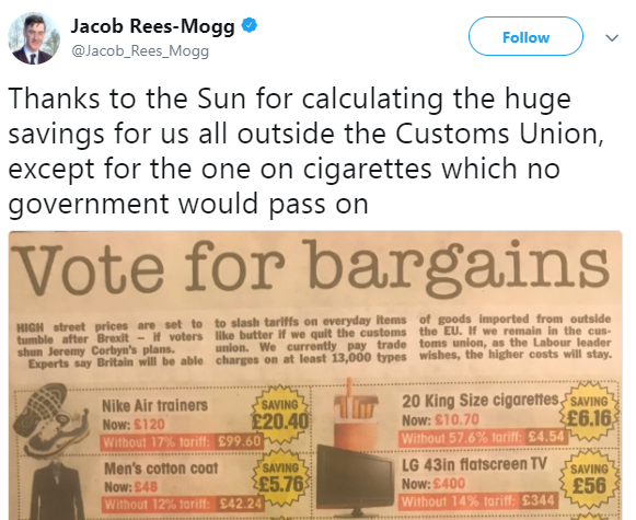
Jacob Rees-Mogg tweeted a photo of an article from The Sun.
Here's screenshot of his tweet:

Rees-Mogg wrote "thanks to the Sun for calculating the huge savings".  Unfortunately they got them wrong.  All of them.

Q1) Explain what they have done wrong.  
Q2) Work out the correct values.

Here is the picture Rees-Mogg posted:


Thursday, 15 February 2018

Quibans 81: Good graph, bad graph

Here are two data representations from the same Daily Telegraph article about shootings in schools in the USA.

Comments?


My thoughts are below.

.

.

.

.

.

.

.

I like the first one.  This is very clear and shows when incidents occurred.  There seem to be several weeks where lots of incidents happened.
February was less incident-filled than January.  (NB this graph was published 15 Feb.)
There are some confusing things: Was 15 Jan a school-day?  There was an incident on a Saturday. What does 'incident' mean?  On the black-cross days - were there 2 incidents or more than that.

In the second graph things seem completely backwards!  Here a smaller bar means the mass-shootings were closer together, which doesn't seem obvious.  Is there a better way to show this? 
Does it matter that the groups of years are not the same size? 

Lots to talk about here!

Source: http://www.telegraph.co.uk/news/2018/02/15/americas-gun-crisis-will-never-end-liberals-learn-make-peace/ 

Monday, 5 February 2018

Quibans 80: Manchester Disunited


Man Utd face pressure to end 'grotesque' failure to pay Living Wage while Alexis Sanchez earns £600k-a-week


1 FEBRUARY 2018

Manchester United will come under major pressure on Thursday to end their “grotesque” failure to pay all workers there the “real” Living Wage after making Alexis Sanchez the highest-paid player in Premier League history during the transfer window.

In November both United and Manchester City faced political pressure to join Liverpool in pledging to ensure everyone who carried out work on their behalf would receive at least £8.75 per hour.

Led by civil society alliance Manchester Citizens, part of campaigning charity Citizens UK, Thursday’s action is accompanied by a release headlined ‘Manchester Divided’, which proclaims Sanchez’s signing has further exposed “a grotesque tale of halves”, in which five of the highest-paid players in the Premier League play for United or City - including Paul Pogba, Kevin De Bruyne, Romelu Lukaku and Zlatan Ibrahimovic - while “low-paid staff at the Theatre of Dreams are facing a real nightmare to meet the real cost of living”.

It also claims Sanchez makes almost as much during one half of football than the annual salary of some cleaning, catering and security staff who work at Old Trafford (£14,625), that it would take someone on the minimum wage 41 years to earn the £600,000 the Chilean takes home each week, and that his agent’s reported £15 million fee would be enough to fund Living Wage pay rises of almost £2,500 for 6,100 low-paid workers.

One such worker at Old Trafford, who did not want to be named for fear of reprisals, said: “We all share the same employer and it would be great if the club could think about all workers’ wages, from football stars to stadium cleaners and caterers”.


Questions:

1) How much does Sanchez earn per year?

2) Assuming he pays tax at 45% on his earnings, how much is his weekly take-home pay?

3) If the stadium workers earn £8.50 per hour, how many hours per week do they work?

4) Example the claims in the penultimate paragraph. Are they true?

5) If he drops a 50p coin, is it worth his while to bend down and pick it up?


Answers:

1) £600,000 x 52 = £31.2 million

2) £330,000 (while he will have a tax-free allowance of about £10,000 and a lower rate for the next chunk of his salary, this is negligible).

3) This is about 36 hours per week, assuming they work for 48 weeks per year. There is something a little strange here, in that presumably many more staff are needed during a match than on other days. Presumably many of the workers are therefore part-time.

4) In one half of football Sanchez makes £14,625? This works if he is considered to be ‘working’ for 30 hours per week throughout the year.

41 year? Yes.

Agent’s fee of £15 million? Yes

5) If you divide his salary up across the week it comes to about 99p per second (even for the time he is asleep). In the ~2 seconds it would take for him to lean down to pick up a 50p coin he will have earned 4 times that!


Source: http://www.telegraph.co.uk/football/2018/02/01/man-utd-face-pressure-end-grotesque-failure-pay-living-wage/

Quibans 110: American eating habits

From the Daily Telegraph My British mind boggles at American eating habits Outside a convenience store in Kansas, I got talking to a ma...